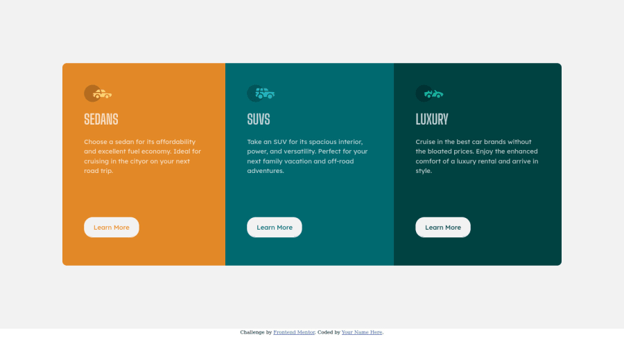
Design comparison
Solution retrospective
Hello folks, i need feedback about my challenge, and still have questions how to make that 3 items background , colors, more dynamic, i just created 3 separate class for that items.
any suggestions and tips will be appreciated . Thank you
Community feedback
- @MojtabaMosaviPosted almost 3 years ago
1- Put a max-width on the top-level container and center it horisontelly on mobile view because to much empty space is not pleasant to eyes. You should also put a max-width on your top-level container becuase on big screen is becomes to wide.
2- The desktop media query should hit a bit later like around 750 or 800px because the content is hard to read when the media quuery hits initialy.
3- Regarding your question because background-colors are usually static but if you want to make them dynamic that involves js.
Keep coding :=)
Marked as helpful1@WijayaacPosted almost 3 years ago@MojtabaMosavi Hi thank you for your suggestions, i will explore with your idea
0
Please log in to post a comment
Log in with GitHubJoin our Discord community
Join thousands of Frontend Mentor community members taking the challenges, sharing resources, helping each other, and chatting about all things front-end!
Join our Discord
