

Design comparison

Solution retrospective
Grateful that i did it but i still think i could have done better. please review it and tell me how i can improve.
What challenges did you encounter, and how did you overcome them?The project was simple and not much tricky designs to make it super hard.
What specific areas of your project would you like help with?when to apply paddings and margins. units to use for measuring(when and why). how height and width work.
Community feedback
- @AdrianoEscarabotePosted 4 months ago
Hello mamman-naf, how are you? I was really pleased with your project, but I’d like to offer some advice that might help:
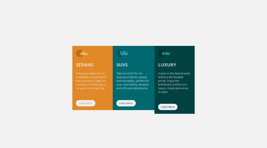
I noticed that you used a button in which case the best option would be an a, because in my head when a person clicks on a button written
Learn More, he is not confirming a form, or something like, it will be redirected to another page, to Learn More about!to solve this problem do this:
<a href="/">Learn More</a>The rest is spot on.
Hope it’s helpful to you. 👍
Marked as helpful0@mamman-nafPosted 4 months ago@AdrianoEscarabote WOW! Didn't think of it that way, I'm glad you noticed. It really was helpful, THANK YOU SO MUCH
1

Please log in to post a comment
Log in with GitHubJoin our Discord community
Join thousands of Frontend Mentor community members taking the challenges, sharing resources, helping each other, and chatting about all things front-end!
Join our Discord