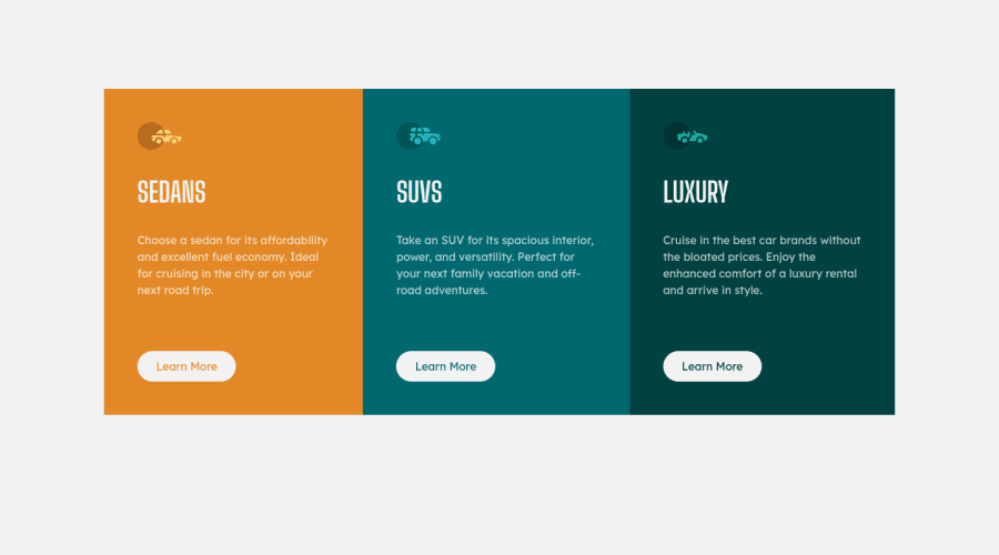
Design comparison
SolutionDesign
Solution retrospective
This was pretty easy to achieve. Corrections and tips are welcome still ❤
Community feedback
- @jmnyaregaPosted over 3 years ago
Impressive work on the challenge. A minor observation, you missed a border radius around the component.
0@trafikiPosted over 3 years ago@jmnyarega Thank you! I'll add that today. Thanks for the feedback
0
Please log in to post a comment
Log in with GitHubJoin our Discord community
Join thousands of Frontend Mentor community members taking the challenges, sharing resources, helping each other, and chatting about all things front-end!
Join our Discord
