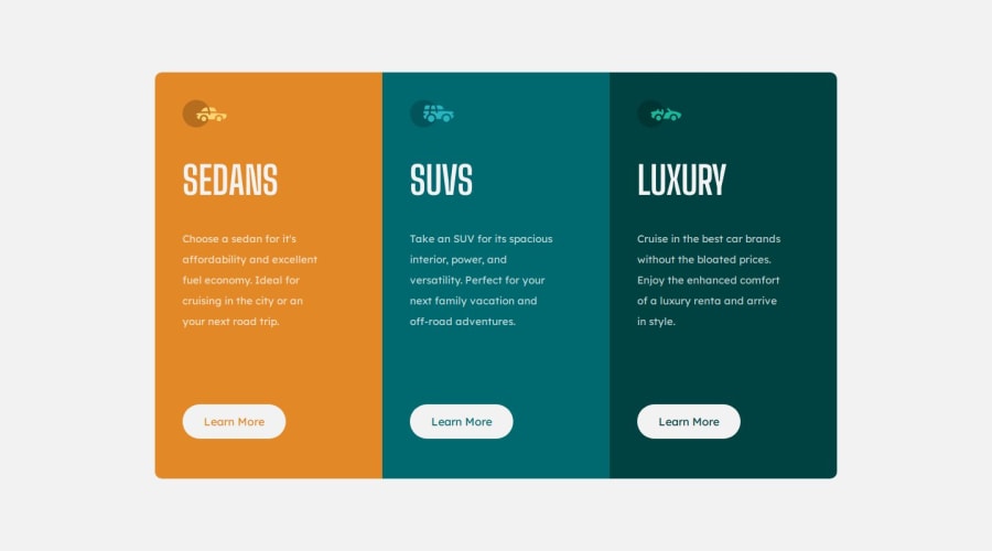
Responsive 3 column card design using css and html
Design comparison
Solution retrospective
so far, this is the fastest i have completed anything on here, i am super happy of that.
What challenges did you encounter, and how did you overcome them?N/A
What specific areas of your project would you like help with?As i said, this is my best so i want alot of criticisms so that i know how i can get better. Please criticisms are welcomed
Community feedback
- @Code-BeakerPosted 5 months ago
Hey there. Congratulations on completing this challenge. I'm sure you must've had fun playing around with your HTML and CSS knowledge! 🎉
I have visited your live site and checked the source code. I have come to notice that while focusing on the looks of the site, you need to make sure you use the most appropriate tags for each element.
- The buttons in this case are links that are styled like buttons. It is better to use
atags when creating links like these. - Use
min-height: 100vhinstead ofheight: 100vh. Using just theheightwill prevent the page's vertical height on mobile phones and smaller devices. - Instead of
px, useremvalues which are more responsive and easier to handle. - Use CSS Variables to make your code more re-usable. You can assign a name to a property and call use that property by that name.
- Your site isn't responsive for mobile so you can try out media queries and optimise it to be viewed on phones.
That's all I've wanted to point out. I hope this helps you improve your solution.
Happy coding! 😄
Marked as helpful0@Stryde2022Posted 5 months ago@Code-Beaker Thanks for the reply, i did not know anything about mobile responsivity, i will look it up right now.
1 - The buttons in this case are links that are styled like buttons. It is better to use
Please log in to post a comment
Log in with GitHubJoin our Discord community
Join thousands of Frontend Mentor community members taking the challenges, sharing resources, helping each other, and chatting about all things front-end!
Join our Discord
