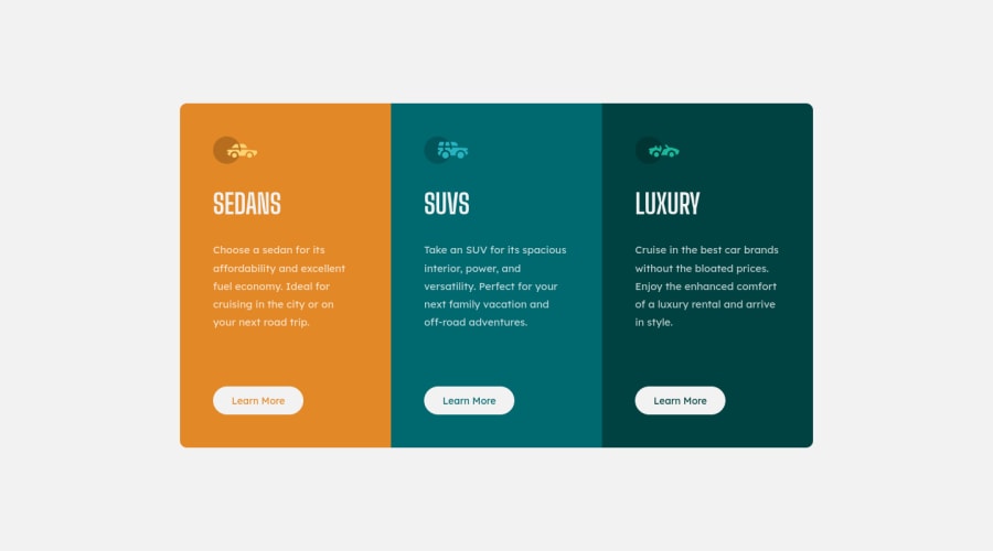
Responsive 3 column card component using flex box and 0 media queries.


Design comparison

Solution retrospective
I found this challenge pretty easy. I used Flexbox for the design I thought it was the most logical choice. I wanted to add an extra challenge by trying not to use any media queries and still have a responsive component.
I had three issues:
1 - When changing the size of the screen the border-radius disappears. I assume that the only way I can solve this is with media queries.
2 - This issue Is not a major problem, however when the screen width is less than 260px the paragraph text doesn't wrap.
3 - When I ran this on lighthouse it gave me the following error: "Each ARIA role supports a specific subset of aria-* attributes. Mismatching these invalidates the aria-* attributes. Learn more." -- It says that the element in question is a div, but I don't have any divs in my HTML. This confused me.
If anyone has the solutions to these issues it would be greatly appreciated.
This is the first time that I have made a thorough readme. Any advice would be great.
Also, any feedback on better practices when coding would be great.
Thanks.
Each ARIA role supports a specific subset of aria-* attributes. Mismatching these invalidates the aria-* attributes. Learn more.
Community feedback
Please log in to post a comment
Log in with GitHub
Join our Discord community
Join thousands of Frontend Mentor community members taking the challenges, sharing resources, helping each other, and chatting about all things front-end!
Join our Discord