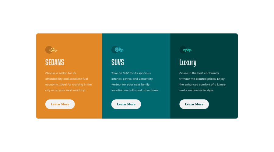
Design comparison
Solution retrospective
I do wonder how you guys get things more pixel perfect. But I think I achieved all the goals of the challenge
Community feedback
- @mycrochipPosted over 2 years ago
Hello Alexander. Well done completing this challenge. You've put forward a wonderful solution nonetheless.
With regards to your concern about how many developers here get to put forward pixel-perfect solutions, some of us have access to Figma/Sketch files (through PRO subscription) where it is easier to ship codes and or view dimensions of design elements; however, most of us (that do not have such access) place on a split window, the provided design images mostly scaled to the desired dimension we are working on (this helps to more accurately predict dimensions and spot differences between our developments and the target designs).
Keep at it. It gets better with time.
Marked as helpful1@ahoin001Posted over 2 years ago@mycrochip thank you for the kind words! And that sounds like a plan. At the moment I also like visiting other solutions after to see what they used and how they dealt with the same problems I did. Really love this place
1 - @mooryxPosted over 2 years ago
congrats on completing this challenge
you can use perfect pixel extension (chrome) and put design images on the browser screen and compare them with your design.
or you can buy premium and get figma and sizes.
I hope that can help you
happy coding :)
Marked as helpful1@ahoin001Posted over 2 years ago@mooryx oh neat thank you! Never heard of that before now
0
Please log in to post a comment
Log in with GitHubJoin our Discord community
Join thousands of Frontend Mentor community members taking the challenges, sharing resources, helping each other, and chatting about all things front-end!
Join our Discord