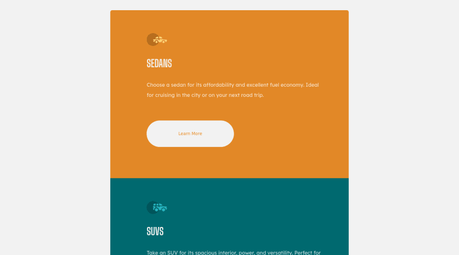
Design comparison
Solution retrospective
As always, any suggestions or recommendations are always welcome!
Let me know what you think!
Thanks everyone!
Community feedback
- @correlucasPosted about 2 years ago
👾Hello @CreatiqueMedia, Congratulations on completing this challenge!
Great code and great solution! I’ve few suggestions for you that you can consider adding to your code:
- The icon doesn’t have an important role when you think about semantics and the html structure. So you can add
aria-hidden=“true”
to avoid it being found and read in the accessibility mode/screen readers. These are only decorative items. - Use
max-width: 100%
for the cards in the mobile version to allow the cards grow 100% of the width considering the paddings and avoid to have a lateral gap (limited by a fixed width). - To make your CSS code easier to work you can create a
single class
to manage the content that is mostly the same for the 3 cards (paddings, colors, margins and etc) and another class to manage the characteristics that are different (colors and icon), this way you'll have more control over then and if you need to change something you modify only one class. - Think about using relative units as
rem
orem
instead ofpx
to improve your performance by resizing fonts between different screens and devices. Anyhow, if we want a more accessible website, then we should use rem instead of px. REM does not just apply to font size, but to all sizes as well.
✌️ I hope this helps you and happy coding!
Marked as helpful1@CreatiqueMediaPosted about 2 years ago@correlucas AWESOME! Man, I really appreciate this type of feedback, it's GREAT! Thanks man, means a lot to me for you to take time to provide such great insight on web dev! I am taking notes from you gurus out there!
0 - The icon doesn’t have an important role when you think about semantics and the html structure. So you can add
- @vanzasetiaPosted about 2 years ago
Hi, there! 👋
Here are some suggestions for improvements.
- There's no need to wrap each element with
section
tag. Also, thosesection
tags are behaving likediv
in this case. So, simplify the HTML markup by removing thosesection
. - Swap all the
h1
withh2
. It is not a best practice to have manyh1
on a page. It can confuse the screenreader users because there will be many titles for a single page. I recommend reading the "How-to: Accessible heading structure - The A11Y Project" article to learn how to use headings correctly. - Always specify the
type
of thebutton
. In this case, set the type of them astype="button"
. It will prevent the button from behaving unexpectedly. - Use
rem
or sometimesem
unit instead ofpx
. Usingpx
will not allow the users to control the size of the page based on their needs. I recommend reading this article aboutrem
andem
unit. This article explains both units in a simple way. - Never limit the height of the
body
element. It will not allow the users to scroll the page if the page content needs moreheight
. You can see the issue by looking at the site on a mobile landscape view. So, my recommendation is to usemin-height
instead. - Never use
100vw
on thebody
as it doesn't account for scrollbars when present. It may only ever introduce potential overflow/scroll bugs. - I recommend using
rem
unit formargin
. The percentage unit is a relative unit. So, it can lead to an unexpected result.
I have three recommended videos. The first one tells how hard HTML is (HTML is not easy). The other two talk about modern CSS techniques and approaches.
- Manuel Matuzović - Lost in Translation - YouTube
- Andy Bell – Be the browser’s mentor, not its micromanager - YouTube
- Stephanie Eeckles - Scaling CSS Layout Beyond Pixels - YouTube
I hope this helps! Happy coding!
Marked as helpful0@CreatiqueMediaPosted about 2 years ago@vanzasetia AHHHHH! Man, I ALWAYS forget about screen readers!!! I always forget about coding practices for accessibility for the handicap as well. Your feedback here is an absolute NUGGET of information. I keep all the notes that you all provide in my OneNote notebook and I refer to it each time I develop something to ensure I am following those best practices.
So, keep the FANTASTIC recommendations and suggestions coming!
Also, thanks for the GREAT homework material!
I got some studying to do today bro!
Love ya guys!
1 - There's no need to wrap each element with
- @zflegle3Posted about 2 years ago
Hey, great solution!
One suggestion I would make is to add a border to your buttons when they are not being hovered. Pick either transparent or the main button background as the color and change the border color on hover. This prevents the layout from shifting on hover because the border is already there and just changing colors.
1@CreatiqueMediaPosted about 2 years ago@zflegle3 You don't like that slight flinch? I think it looks kinda cool, but I know what you are talking about.
Thanks for the feedback brother, I appreciate it.
1
Please log in to post a comment
Log in with GitHubJoin our Discord community
Join thousands of Frontend Mentor community members taking the challenges, sharing resources, helping each other, and chatting about all things front-end!
Join our Discord