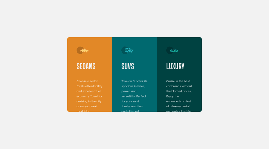
Responsive 3 Column Card built with CSS Grid
Design comparison
Solution retrospective
I wasn't able to match up the text height as compared to the solution. I am curious on what I could improve on to get it closer to the original
Community feedback
- @Make310Posted about 3 years ago
first, sorry for my bad english. If you are using grid, don't give each one a fraction but define a specific width in pixels or rem. and then you center it. This way you have the desired width. or a more rustic way of doing it is simply setting a max-width to the width of the container.
Marked as helpful0@itsreallydrewPosted about 3 years ago@Make310 Thank you for the response! Are you referring to a max-width on the parent container or the for each individual card item? I was aiming to keep it as dynamic as possible without hardcoding a value in. Could I have combined that with a minmax function?
0
Please log in to post a comment
Log in with GitHubJoin our Discord community
Join thousands of Frontend Mentor community members taking the challenges, sharing resources, helping each other, and chatting about all things front-end!
Join our Discord
