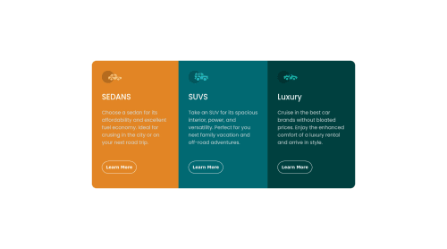
Submitted almost 3 years agoA solution to the 3-column preview card component challenge
Responsive 3 Cards Component usign flexbox
accessibility
@M-UmarHashmi

Solution retrospective
I am curious that the tags used by me to make this project are correct or not? Any help is higly appreciated.
Code
Loading...
Please log in to post a comment
Log in with GitHubCommunity feedback
No feedback yet. Be the first to give feedback on Muhammad Umar Hashmi's solution.
Join our Discord community
Join thousands of Frontend Mentor community members taking the challenges, sharing resources, helping each other, and chatting about all things front-end!
Join our Discord