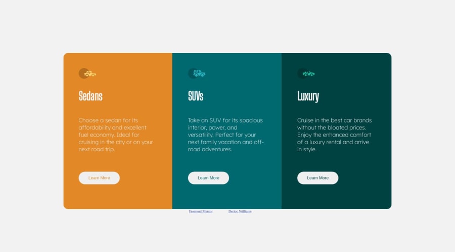
Design comparison
Solution retrospective
I couldn't figure out how out how to vertically center the cards without the attribution getting in the way so i made a container to hold the cards, how did ya'll solve this challenge without the extra div?
Community feedback
- @burrijwPosted over 1 year ago
Hey, good start!
There's nothing wrong with using an "extra" div if it has a purpose. Ain't nothing wrong with a div as long as you are using it with intent. You actually do need some kind of wrapper element around the three sections so that you can change the way they are laid out based on the screen. You want them stacked vertically on mobile and horizontally on desktop, so you need some way of controlling that. I'd use flexbox, personally.
- Make sure you have all your primary page content in a
<main>
. - Use a
<footer>
for the attribution. - Try setting the
border-radius
on the wrapper with overflow set tohidden
instead of trying to manage theborder-radius
of each individual card.
Good luck! Refactor this and submit it again! 😄
Marked as helpful2@whoisderionPosted over 1 year ago@burrijw
Hey thanks for the awesome response,
It makes sense that purposeful divs are okay. Also I was able to implement the changes that you mentioned which helped to pass the tests and get much closer to the design. That last tip about the border radius is especially helpful and will keep that in my toolbox as I work on more complex designs.
Thanks again and have a great day :)
0 - Make sure you have all your primary page content in a
Please log in to post a comment
Log in with GitHubJoin our Discord community
Join thousands of Frontend Mentor community members taking the challenges, sharing resources, helping each other, and chatting about all things front-end!
Join our Discord