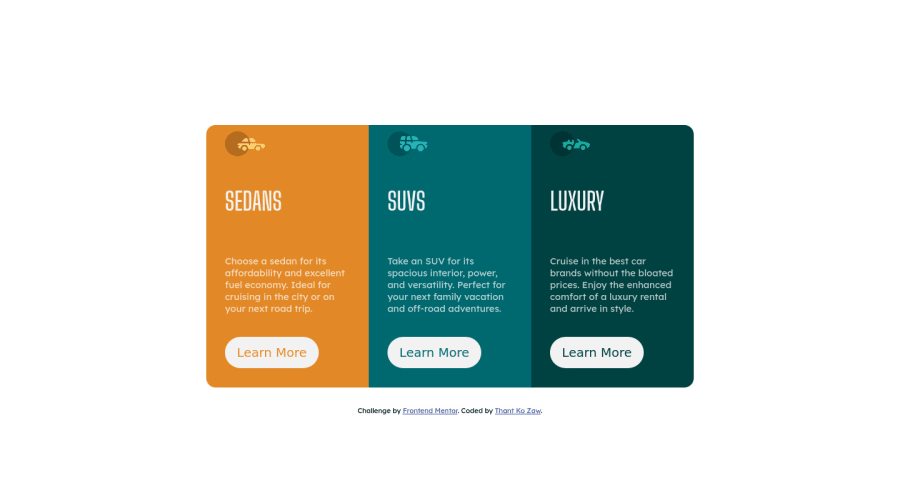
Responsive 3 card column preview cards using CSS Flexbox
Design comparison
Solution retrospective
Hi. I think I messed up at centering the flex container vertically. Is there any way to center the container vertically?
Community feedback
- @rachanahegdePosted over 3 years ago
Hi! This looks good but to make your buttons look more like the buttons in the design, you can modify the font-size and make it 15px. This is the same font size as the paragraphs.
Marked as helpful1@thantko20Posted over 3 years ago@rachanahegde Thank you for your suggestion! I just realized my buttons look pretty bad after submitting. I will try that out!
1@rachanahegdePosted over 3 years ago@thantko20 Great! Also, I'm not sure if I misunderstood your question about centering the container but you could try adjusting the margins to position it the way you want it to. (This was what I did instead of centering it.)
1 - @MdesignscdrPosted over 3 years ago
use 'align-items: center;'
0@thantko20Posted over 3 years ago@Mdesignscdr I have tried that. But it doesn't seem to be working.
0
Please log in to post a comment
Log in with GitHubJoin our Discord community
Join thousands of Frontend Mentor community members taking the challenges, sharing resources, helping each other, and chatting about all things front-end!
Join our Discord
