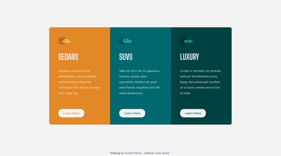
Responsive 2-Column Card Preview using Flexbox
Design comparison
Solution retrospective
Hey guys! The only question I really have is about the "Learn More" link. I just have it as an anchor tag in my code, and I was wondering if that was okay, or if it would be better to give it a button tag? Thanks in advance for any feedback!
Community feedback
- @folathecoderPosted over 3 years ago
Hi Lesley!
Based on this project, the use of "a" tag is appropriate since its only function is to link to an external or internal source.
There are other use cases where the button tag is appropriate. You can check out this article to learn more about buttons: https://css-tricks.com/use-button-element/
Have a great day!
Happy Coding! 😎1@LesleyWesleyPosted over 3 years ago@folathecoder Thank you! I thought I was probably on the right track, but I wanted to make sure, because that's something I always get confused about. I'm definitely bookmarking that article for future reference! haha
0 - @grace-snowPosted over 3 years ago
Hi Lesley
Firstly, this looks great. There are 2 important accessibility issues with the code
-
Html root size in pixels can break the site for those who rely on different zoom settings. If you want to change size on html it should be in percent or rem. Usually you shouldn't need to do this, just pop it in rem on the body (15/16 = rem size in this case)
-
Use CSS to capitalise text in those headings. Screenreaders read capitals as individual letters if that's how html is written. So
SUVs
would be read out correctly, butSUVS
ORLUXURY
would not.
0@grace-snowPosted over 3 years agoOther than that the only improvements I have for you are to do with making css a lot shorter / more easily responsive...
I don't think you need as many media queries on this. That all stems from using percentage widths for containers as your main/only technique for width limiting.
Instead, use some padding on an outer wrapper to ensure content can't hit the sides of the screen. Then let block elements be their default 100% width and use max-width elsewhere (in rem or px) to limit how large they can grow.
You will have more consistent results this way and usually need far fewer media queries.
0@LesleyWesleyPosted over 3 years ago@grace-snow Thank you for the detailed feedback and tips! :)
0 -
- @paiputPosted over 3 years ago
I think it's okay, I did the same way. And I think it's because those buttons are supposed to take you to another page on your website.
0
Please log in to post a comment
Log in with GitHubJoin our Discord community
Join thousands of Frontend Mentor community members taking the challenges, sharing resources, helping each other, and chatting about all things front-end!
Join our Discord