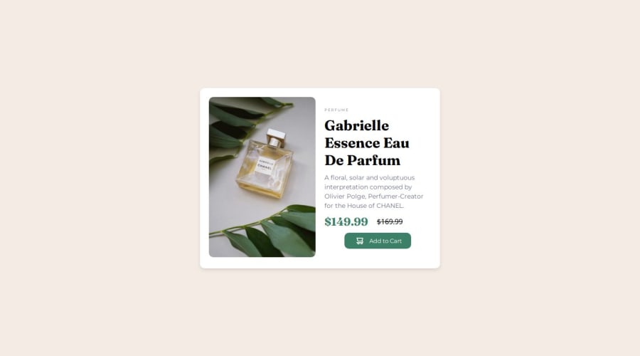


Design comparison

Solution retrospective
💡 What I’m Most Proud Of: 🎯 The responsiveness is smooth and pixel-perfect on all screen sizes. 🎯 Learned to combine Grid & Flexbox effectively for layout structuring. 🎯 The image swap technique for mobile/desktop makes the UI more dynamic.
🔄 What I’d Do Differently Next Time: 🛠️ Use CSS clamp() or fluid typography for better text scaling across devices. 🛠️ Implement animations/transitions to enhance user experience. 🛠️ Optimize the code further using SCSS for better maintainability.
What challenges did you encounter, and how did you overcome them?🔥 Challenges I Faced & How I Solved Them: 1️⃣ Image Not Changing for Mobile View 🔹 Initially, the picture tag didn't work as expected. Instead, I used content: url(...) in CSS for a smooth image switch in mobile view.
2️⃣ Centering the Card on the Page 🔹 I struggled with positioning, but using display: flex on the body with align-items: center; justify-content: center; height: 100vh; solved the issue.
3️⃣ Aligning the Button’s Text & Icon Properly 🔹 The icon and text were misaligned. Fixed it by using display: flex; align-items: center; gap: 10px; inside the button.
Community feedback
- P@pawelni123Posted 6 days ago
Good job overall, but pay close attention to the details and compare them with the reference image. The font, colors, and sizes differ significantly from the original design — especially the prices! The button width could also be improved, along with the line height and spacing between sentences in the description. Solid work, but polish those details!
0

Please log in to post a comment
Log in with GitHub
Join our Discord community
Join thousands of Frontend Mentor community members taking the challenges, sharing resources, helping each other, and chatting about all things front-end!
Join our Discord