Responsive - Mobile - First - manage-landing-page-master
Design comparison
Solution retrospective
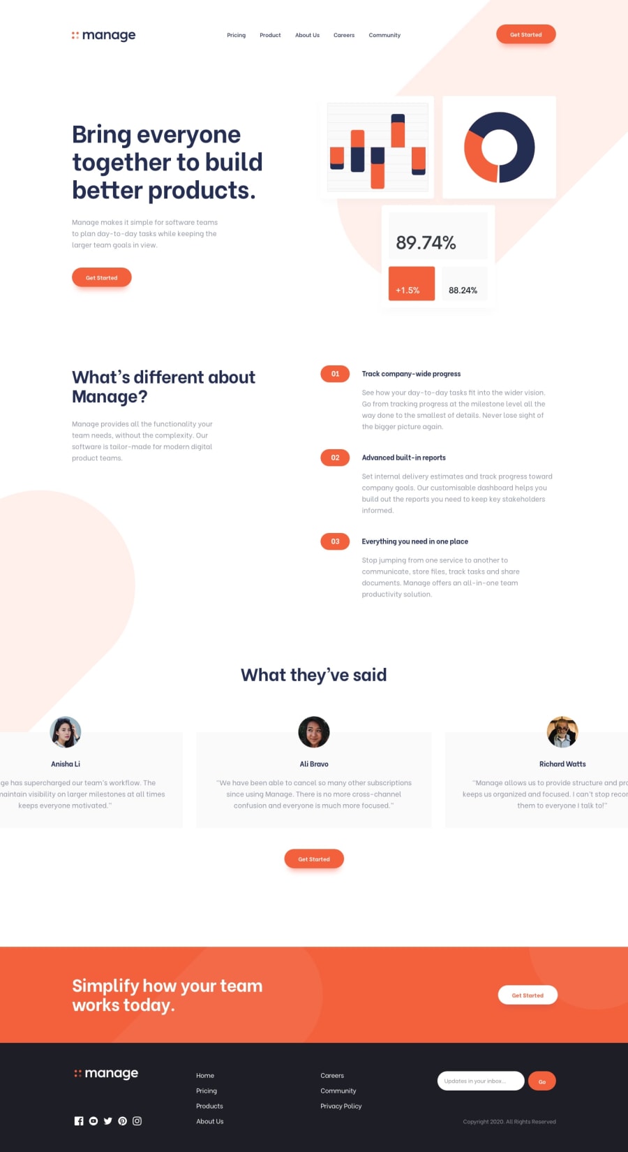
For the socials - I copied and pasted the entire svg into the html and removed the fill: #fff and then in the css I used the fill property to make them white again and I used the fill property again with the socials :hover to turn them bright-red. I also had to make the socials bigger so for this I used transform-origin: left top; and transform: scale(1.8) which worked an absolute charm!
For the footer logo I just make a copy of the svg and turned the fill for the word - manage - from blue to white.
For the slider on the mobile size - I created an array for both the dots and the slides/cards and linked them by using their indexes. I also used a forEach on both to remove any filled in dot and any "active" slide before adding the fill and active to the e.target. This was fun to figure out... well it was fun when I finally figured it out!
The error message under the email and Go buttons were slightly moving some other elements when activated so I used visibility: hidden/visible on it instead of display: none/block.
I watched this Kevin Powell youtube video to help with the horizonal scrollbar (which uses CSS only): https://www.youtube.com/watch?v=3yfswsnD2sw&t=171s It is fabulous - I learnt so much - thanks again, Kevin - you are a genius!
So once again I find myself a little sad that yet another challenge is over but I know that someday I may revisit it even if it is just to have a good ole chuckle at my primitive code :).
Community feedback
Please log in to post a comment
Log in with GitHubJoin our Discord community
Join thousands of Frontend Mentor community members taking the challenges, sharing resources, helping each other, and chatting about all things front-end!
Join our Discord
