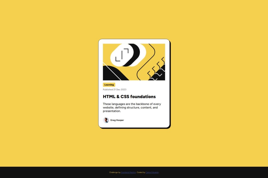
Design comparison
Solution retrospective
I’m proud of how I made the design responsive and look good on different devices. I learned that paying attention to small details like spacing and alignment can make a big difference.
What challenges did you encounter, and how did you overcome them?One of the main challenges was keeping the design consistent across different screen sizes.
What specific areas of your project would you like help with?I’d like help with optimizing the code, especially when it comes to performance and organizing the CSS. Feedback on accessibility and improving the user experience on mobile devices would also be helpful.
Community feedback
- @Lukas3162000Posted 6 months ago
I really like that you made your html semantic, makes the code much easier to understand :)
Here are just some minor things that you might've overlooked during coding:
- The Hoverstate for the headline (on hover supposed to be #F4D04E) (creating an easy user-feedback and thatwith creating a nicer interactive experience)
- The color of the text (should be #6B6B6B) (More visually pleasing / less prominent)
- line-height of the p element should be at 150% (To improve readability / UX)
Little tweeks that u can implement quickly to make a difference for users, hope that helps :)
greetings, Lukas
1
Please log in to post a comment
Log in with GitHubJoin our Discord community
Join thousands of Frontend Mentor community members taking the challenges, sharing resources, helping each other, and chatting about all things front-end!
Join our Discord
