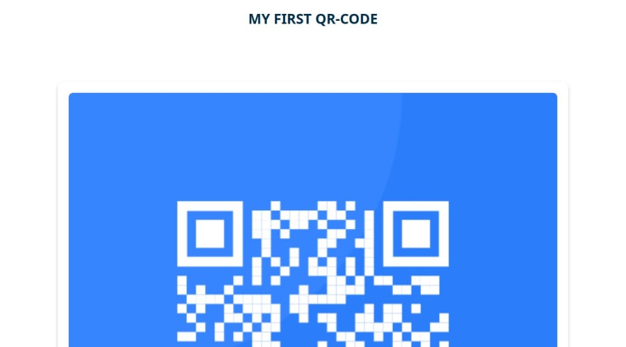
Design comparison
Solution retrospective
That I could make the website responsiv, by using media queries. I focused on desktop screen-size and phone screen-size. Next time I would like to add more information or interaction on the website.
What challenges did you encounter, and how did you overcome them?At first was how to start, with the thought that the style-guide looked really simple and something I have done before. But this lead me to seek reference guidance through w3schools with a specific issue, for example how to create a card.
What specific areas of your project would you like help with?The sizing of the card and qr-code on desktop screen-size. And code structure to see if there is any improvement to do there.
Community feedback
- @akibraza91Posted 5 months ago
Hello there!
Congrats on completing the challenge! ✅
Your solution is really impressive!
I've got a couple of ideas (about how to use HTML better) that could make it even stronger:
Think about using
<main>to wrap your main content instead of<div>Imagine
<div>and<span>in HTML as basic containers. They're good for holding stuff, but they don't tell us much about what's inside or its purpose on the webpage.These tweaks might not change how your page looks, but they'll make your HTML code clearer and help with SEO and accessibility.
Hope that's helpful!
Keep up the great work!
Marked as helpful0@Mimi3678Posted 5 months ago@akibraza91 Thank you sooo much for the feedback! Really appreciate
0
Please log in to post a comment
Log in with GitHubJoin our Discord community
Join thousands of Frontend Mentor community members taking the challenges, sharing resources, helping each other, and chatting about all things front-end!
Join our Discord
