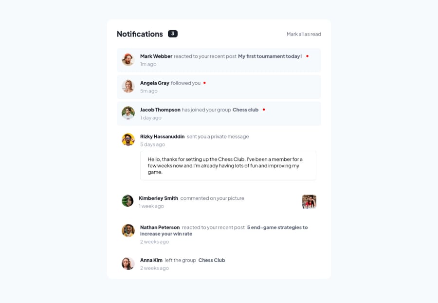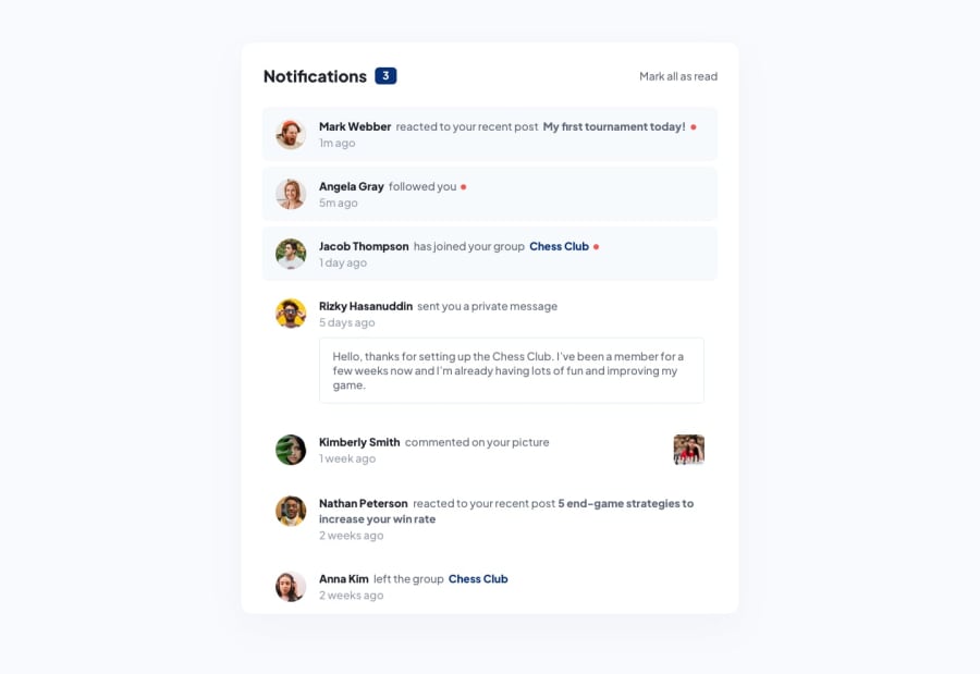
Design comparison
SolutionDesign
Solution retrospective
I found this one very pleasing challange, as I am now beginning to understand how much space have how much importance, i.e space just between name and time and the bold highlighted links. I am able to learn so much. Regards to this awesome community. If you find it good then like it and if you have any suggestion fro me please Welcome.
Community feedback
Please log in to post a comment
Log in with GitHubJoin our Discord community
Join thousands of Frontend Mentor community members taking the challenges, sharing resources, helping each other, and chatting about all things front-end!
Join our Discord
