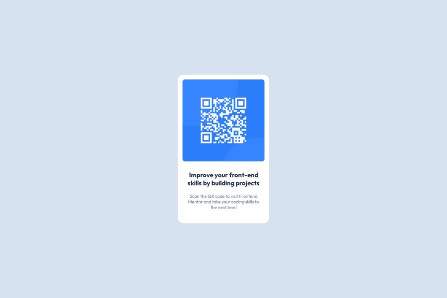
Design comparison
SolutionDesign
Solution retrospective
What are you most proud of, and what would you do differently next time?
I'm glad I made the card pretty close to the design. Next time, I'll try to make components with React so I can re-use them in the future.
What challenges did you encounter, and how did you overcome them?I've stumbled upon a poor understanding of how HTML and CSS work while I was positioning the elements, but Google and GPT helped me to fill in the gaps.
What specific areas of your project would you like help with?It felt easy enough, and I feel like it's almost perfect, but it's my first project, so I believe this feeling is incorrect. I don't have any specific questions for help, but I'd like some feedback to understand if this work is okay and what I can do to improve it.
Community feedback
Please log in to post a comment
Log in with GitHubJoin our Discord community
Join thousands of Frontend Mentor community members taking the challenges, sharing resources, helping each other, and chatting about all things front-end!
Join our Discord
