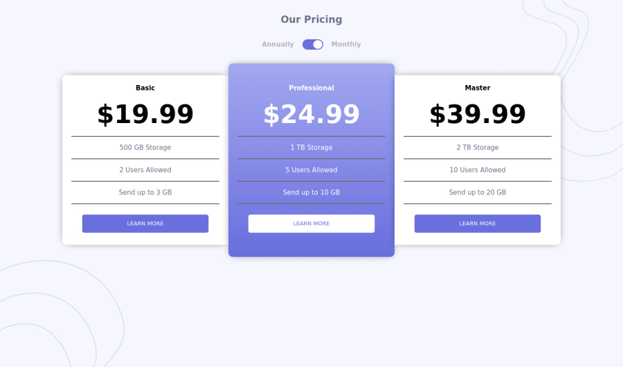
Responsible-pricing-component
Design comparison
Solution retrospective
open to any suggestions
Community feedback
- @elaineleungPosted over 2 years ago
Hi Mubizzy, I just got a few quick suggestions:
-
You can try centering everything using
display:grid,place-content:center, andmin-height: 100vh(instead of theheight:100%) on your body selector, and move all the background image information from the container to the body. -
The font for the design doesn't seem to be showing up, and I don't see it in the head tags either; so you might wan to add that in
-
I think each section can use a bit more padding, especially the top and bottom padding
-
The clicking works well, maybe you can consider adding some transition effects!
That's about it, great work!
0 -
Please log in to post a comment
Log in with GitHubJoin our Discord community
Join thousands of Frontend Mentor community members taking the challenges, sharing resources, helping each other, and chatting about all things front-end!
Join our Discord
