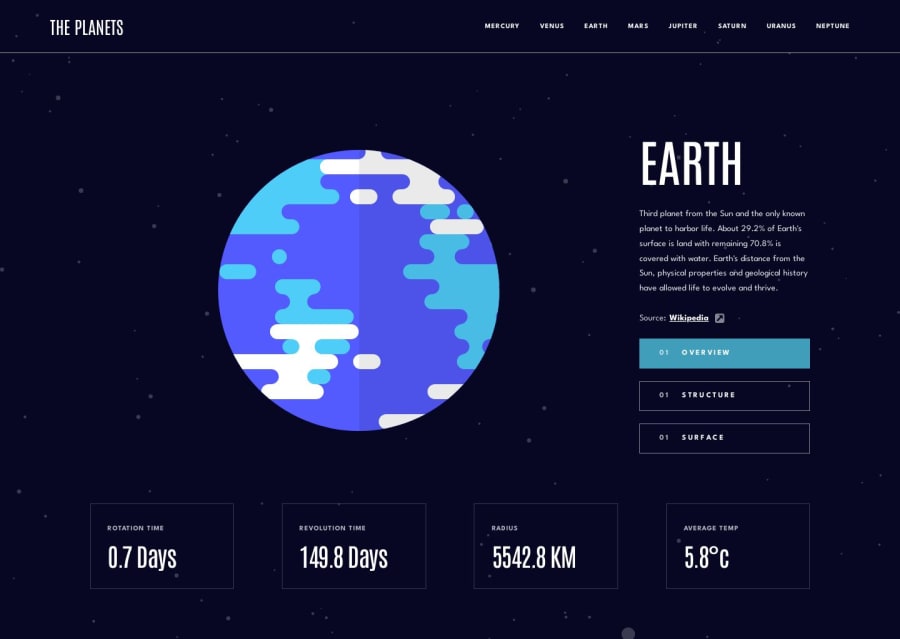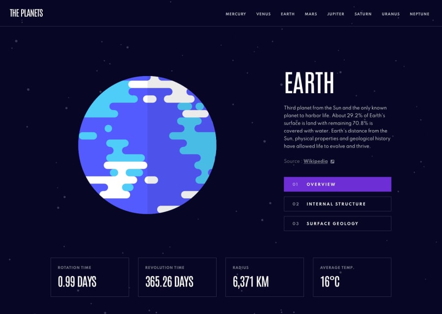
Responsible webpage with the usage of history API.
Design comparison
Solution retrospective
How to deal when you have images with different sizes? In this problem, the greatest problem I had was to make my project design approach Figma's design. For example, Saturn has a lot of blank space, something that doesn't happen for other planets. Also, if the planet is too big, the margin I need will never be the same. For the image of the planets surface, for example, Uranus' surface image, depending on the screen width will be over the Revolution time div. So considering that, what are great practices that help dealing with this? Also, when should I use history API and when should I just replace content with js. In this project, I choosed to use history API, but I don't think it's the correct decision.
Community feedback
- @dylanson25Posted over 1 year ago
Hi Gabriel, I like your solution. In fact, the animation with the numbers is great. Could you please explain it to me?
Regarding your question about the surface, honestly, I set the same size for the surface image and the planet. I used vw and the rule of three with respect to the size in Figma.
One point to improve is that the navbar toggler would be cool if it automatically closed the menu when I select a new planet.
This is my solution, but I think that I can improve it after seeing your solution. https://planets-project.vercel.app/#
1@gabrielayresdevPosted over 1 year agoHi @dylanson25, I'm glad you liked it! I appreciate the feedback and the tips on how to handle images of different sizes. Regarding the animation of the numbers, I first store the value of the number in a variable and then set the number.innerHTML to 0. After that, I define the rate at which the number will increase as initialValue/100. Then, I call the following function that will add the increment to the displayed value within a setInterval.
   function callback() {
      actualValue += increment;
      item.innerHTML = actualValue.toFixed(1);

      if (Math.abs(actualValue) > Math.abs(initialValue)) {
        clearTimeout(interval);
        item.innerHTML = initialValue;
      }
    }
Your solution also turned out very well. Indeed, setting the image values as a fixed size proportional to the screen didn't cause other elements to be pushed around. I'll take a look at your repository to improve my own work.
Regarding improvements, I don't have much to comment on since your project turned out really well. However, I think you could make some subtle changes, such as adding a "cursor: pointer" to the buttons and including "target="_blank"" in the source links.
0
Please log in to post a comment
Log in with GitHubJoin our Discord community
Join thousands of Frontend Mentor community members taking the challenges, sharing resources, helping each other, and chatting about all things front-end!
Join our Discord
