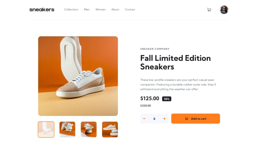
Design comparison
Solution retrospective
Hey there friends This is the solution to the ecommerce product landing page.
I couldnt fully create this project.There are a few things that i couldnt figure out
First when the light box is opened the background should be dim.I tried it but it didnt work well like when i apply the Background and the opacity the whole page including the lightbox gets those properties
Secondly the nav menues its hiding behind the lightbox image in mobile display.
Guide me how did you tackle this problem.Eagerly waiting for responce
Community feedback
- @sulemaan7070Posted almost 2 years ago
hey Suleman Tasawar😄, congratulations on completing the challenge.. as for your querires.. I have played around with the site...
1.Firstly the nav was not behind.. there is some inheritance issue.. height:100% is going to inherit the height of the parent... so, this code seems working try it..
.nav {
    z-index: 1;
    position: fixed;
    padding-top: 20px;
    left: 0%;
    top: 0;
    display: none;
    flex-direction: column;
    justify-content: flex-start;
    align-items: center;
    width: 200px;
    height: 120vh;
    background: #fafafa;
}
2.and as for the lightbox query instead of playing the opacity of the website you can add an overlay which covers the whole screen and is having the effect you are looking for..
Hope that helps, happy coding🔥👍🏻💯 and feel free to ask for any help
Marked as helpful1
Please log in to post a comment
Log in with GitHubJoin our Discord community
Join thousands of Frontend Mentor community members taking the challenges, sharing resources, helping each other, and chatting about all things front-end!
Join our Discord
