Responsibe, mobil first, font size wroud, BEM, CSS, HTML


Design comparison

Solution retrospective
Continue improve the html semantic. Continue learning about css styles tricks and best practices to write css.
What challenges did you encounter, and how did you overcome them?Manage image like background with the propertie overflow:hidden
What specific areas of your project would you like help with?Accesibility
Community feedback
- P@StroudyPosted 6 months ago
Amazing job with this! You’re making fantastic progress. Here are some small tweaks that might take your solution to the next level…
- These
<div>should really have semantic tags like headings (<h1> to <h6>) and paragraphs (<p>) convey structure and meaning to content, improving accessibility, SEO, and readability by helping search engines and screen readers interpret the content.
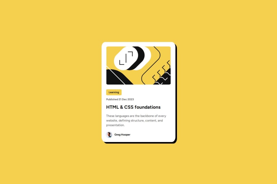
<div class="card__date">Published 21 Dec 2023</div>-
Setting
font-size: 62.5%can affect accessibility by reducing the default browser font size, potentially making text harder to read for users with visual impairments. This does make it easier to work out the relative units but at what cost? -
Using
position: absoluteis not always best practice because it removes elements from the normal document flow, making layouts harder to manage and potentially causing overlap or misalignment on different screen sizes. Instead, use flexible layout techniques like CSS Grid or Flexbox for more responsive and maintainable designs. -
Using
remoremunits in@mediaqueries is better thanpxbecause they are relative units that adapt to user settings, like their preferred font size. This makes your design more responsive and accessible, ensuring it looks good on different devices and respects user preferences. -
Using a full modern CSS reset is beneficial because it removes default browser styling, creating a consistent starting point for your design across all browsers. It helps avoid unexpected layout issues and makes your styles more predictable, ensuring a uniform appearance on different devices and platforms, check out this site for a Full modern reset
-
For future project, You could download and host your own fonts using
@font-faceimproves website performance by reducing external requests, provides more control over font usage, ensures consistency across browsers, enhances offline availability, and avoids potential issues if third-party font services become unavailable. Place to get .woff2 fonts
You’re doing fantastic! I hope these tips help you as you continue your coding journey. Stay curious and keep experimenting—every challenge is an opportunity to learn. Have fun, and keep coding with confidence! 🌟
Marked as helpful0@mgallegoaPosted 6 months agoHi @Stroudy ,
Thanks for chacking this.
I don't thinked about the fact of 'font-size: 62.5%' could interrupt the user experience with visual impairments.
1 - These

Please log in to post a comment
Log in with GitHub
Join our Discord community
Join thousands of Frontend Mentor community members taking the challenges, sharing resources, helping each other, and chatting about all things front-end!
Join our Discord