Submitted almost 3 years ago
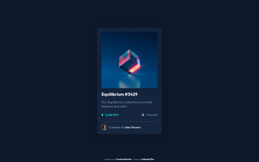
Responive NFT Preview Card Component made with JS, HTML5, CSS3
@abdoachhoubi
Design comparison
SolutionDesign
Community feedback
- @RioCantrePosted almost 3 years ago
Hello there! Great job with this one. Viewing your solution, I would suggest the following for you...
- Instead of using inline style, import it on the CSS file
- It's better to use
maintag to wrap the whole content rather than withheader - Instead of using
h3another alternative isspan - Add the import font style in the CSS file and remove
styletag, alternative is to use CDN
Hope this helps and Keep up the good work!
Marked as helpful1 - @anoshaahmedPosted almost 3 years ago
hey good job on this challenge! your report above shows a few issues though:
- wrap everything in your body in
<main>OR use semantic tags! if you're usingdivright afterbody, then give them arole=""; however, it's a little frowned upon to useroleright after body, so try to stick with semantic tags instead. you can read more about landmarks here - start headings with
<h1>, and move up by one level each time - add language to html like so:
<html lang="en">
here is a list i made of accessibility issues & best practices
hope this helps :))
Marked as helpful1 - wrap everything in your body in
Please log in to post a comment
Log in with GitHubJoin our Discord community
Join thousands of Frontend Mentor community members taking the challenges, sharing resources, helping each other, and chatting about all things front-end!
Join our Discord
