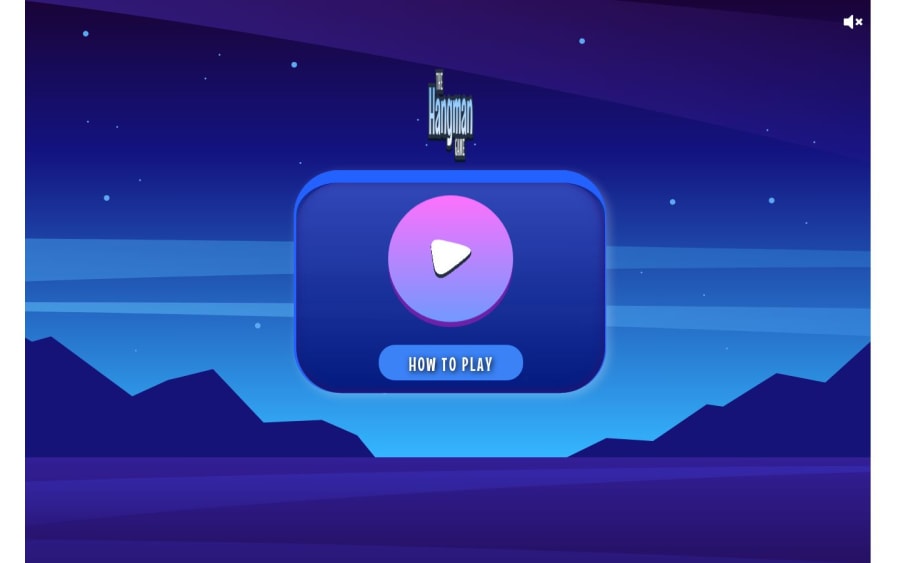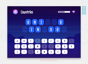
Design comparison
Solution retrospective
Some of the shadow/layering details to enhance a more cartoon-y effect on the UI was good practice/something worth remembering
The styling got a little mess, between Tailwind, custom CSS and some framer-motion, it'd be worth tidying that up/maybe improving.
What challenges did you encounter, and how did you overcome them?Again, the styling got a little away from me as far as clean organized setup. Intro/exit animations on the different could be done better, in that there aren't any exit animations as I found Next to operate differently enough to not really accommodate framer-motions easy setup with plain React.
The audio btn has a bug to where first click doesn't toggle the audio off but after that its on track. Again, will probably go back and clean that up.
What specific areas of your project would you like help with?It could just benefit with a good code cleanup between the styling and also the components folder structure. Still haven't quite clicked into a natural rhythm with Next, for whatever reason. lol. Feedback and suggestions definitely all welcomed and appreciated!
Community feedback
- @sksksk2024Posted 4 months ago
🔥 Great job on creating a responsive and animated solution for Hangman! The animations are modern and engaging, which makes the game feel fresh and exciting. I also love how your website has a playful, game-like aesthetic—it's inviting and fun!
One thing to note: after finishing a round, the solution is visible for a moment, which makes it easy to cheat if someone is paying attention. It might be worth tweaking this to prevent players from getting an unfair advantage.
Keep up the fantastic work! 🎮✨
Marked as helpful1
Please log in to post a comment
Log in with GitHubJoin our Discord community
Join thousands of Frontend Mentor community members taking the challenges, sharing resources, helping each other, and chatting about all things front-end!
Join our Discord
