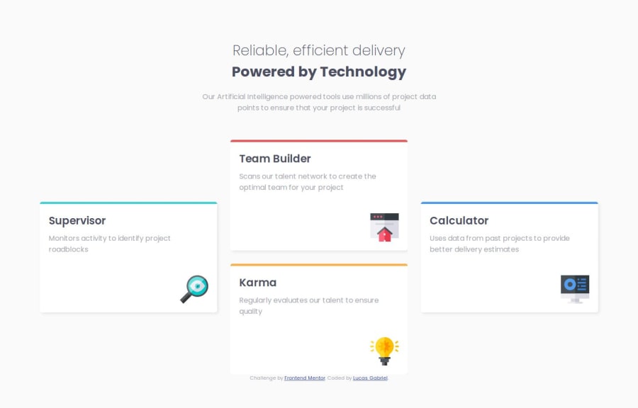
Respondsive four card feature section using Flexbox Layout
Design comparison
Community feedback
- @AdrianoEscarabotePosted 6 months ago
Hi Lucas Gabriel, hope you're doing well! I loved how your project turned out, but I’ve got a few suggestions that could be useful:
<h1>Reliable, efficient delivery</h1>
<h1>Powered by Technology</h1>
The most appropriate in this case would be just an h1 tag! containing the two contents, to make them break a line, we can use a max-width, and for the styling we can use a span element with the content that will be changed!
The main tag must be present in every HTML document so that we can recognize the main content. To fix this, wrap the main content in the main tag. Users of assistive technology will have a better navigation experience on your site thanks to the use of HTML5 landmark elements.
The rest is fantastic.
Hopefully, you'll find it helpful. 👍
0 - @tris6Posted 6 months ago
Nice efficient code! I'm studying your use of selectors and properties to do this in only 120 lines.
I've read in a few places it's good to only have one <H1> in a page. Might be something to watch out for.
There's also room to match the box sizing and title formatting more closely. But as a learning experience I can understand there's not much to be gained from this detail.
0
Please log in to post a comment
Log in with GitHubJoin our Discord community
Join thousands of Frontend Mentor community members taking the challenges, sharing resources, helping each other, and chatting about all things front-end!
Join our Discord
