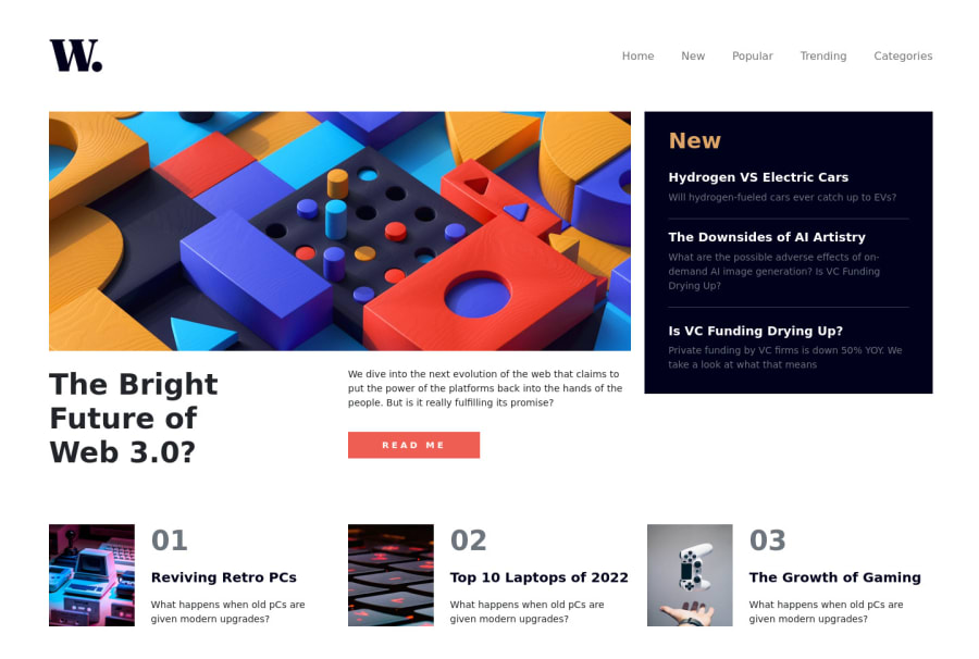
Design comparison
Solution retrospective
Please give me some feedback about my work.
I'm just new to this, hoping I can learn from your feedback.
Good bless you!
Community feedback
- @AdrianoEscarabotePosted almost 2 years ago
Hi Rico Tasong, how are you? I really liked the result of your project, but I have some tips that I think you will enjoy:
I noticed that you used a
buttonin which case the best option would be ana, because in my head when a person clicks on a button written READ ME, he is not confirming a form, or something like, it will be redirected to another page, to Read More about!to solve this problem do this:
<a href="/" class=" mt-3 border-0 fw-bold">READ ME</a>images must have alt text unless it is a decorative image, for any decorative image each IMG tag must have empty
alt=""and addaria-hidden="true"attributes to make all the assistive technologies of the Web, as screen reader. Learn the differences between decorative/meaningless images vs important content.every html document must contain a main tag, to inform what is the main content of the page, as this page is a complete page, that is, it has a header a main and the footer, wrap the main content with the main tag , for users who use screen readers, to be able to understand what the main content of the screen is!
The rest is great!
I hope it helps... 👍
0 - @nurbektiawPosted almost 2 years ago
I think you forget to give hover effect on most of it's active state. overall looks good.
0
Please log in to post a comment
Log in with GitHubJoin our Discord community
Join thousands of Frontend Mentor community members taking the challenges, sharing resources, helping each other, and chatting about all things front-end!
Join our Discord
