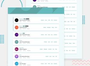
Design comparison
SolutionDesign
Solution retrospective
What did you find difficult while building the project? Items filter, this logic was really hard for me. I based it on states but keep it as a one was really hard -.- Did I overthink this ?
Which areas of your code are you unsure of? Styling with a side scrollbar, when it disappears, the entire page makes a small jump to the right. Also the website lacks animation which makes it look heavy but I opted for stylized components, next time I will definitely choose sass :p
Do you have any questions about best practices? Is there any good basic lib helping with state filtering?
Community feedback
Please log in to post a comment
Log in with GitHubJoin our Discord community
Join thousands of Frontend Mentor community members taking the challenges, sharing resources, helping each other, and chatting about all things front-end!
Join our Discord
