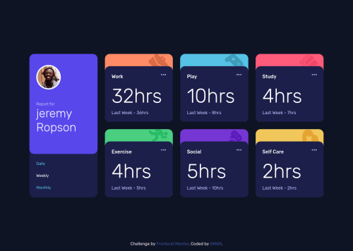
Resonsive Time Tracking Dashboard With Grid and Flex
Design comparison
Solution retrospective
Any feedback will be welcome so take a look and tell me your opinion Thanks
Community feedback
- @Yehan20Posted over 2 years ago
Hey Congratulations on completing the challenge , It would be good if you could make the grids divide at a lower width , when I viewed from my laptop it was not like the screenshot. You could divide it after around 991px may be , also the the footer looks kind of , together with the content, you could just always keep it in the bottom, You could do this by changing your height in the body to min-height and the flex direction to column, also having border-radius to 20px in the * selector may not be ideal since the body is also affected. Also remove the position absolute from the attribution tag , since it will cause some issues , I hope my feedback was helpful , Good luck for the next Challenges.
Marked as helpful0@0GeNN0Posted over 2 years ago@Yehan20 Thanks for your replay it was helpful to me and I edited as you say except border-radius in * selector to decrease the number of lines in code I won't do this in a real project just to provide time I hope you like it Thanks, a lot
0
Please log in to post a comment
Log in with GitHubJoin our Discord community
Join thousands of Frontend Mentor community members taking the challenges, sharing resources, helping each other, and chatting about all things front-end!
Join our Discord