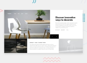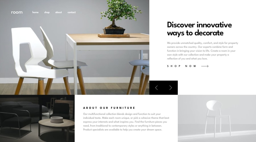
Design comparison
SolutionDesign
Solution retrospective
i hope you like it please note me
Community feedback
- @ArtequePosted 9 months ago
Hi Youcef Laala,
Though I don't know if it's just me, but for me, there was no margin-inline: auto; for the divs. Everything is on the left side. Perhaps you need a container element for all the elements or something like: body { width: fit-content; margin-inline: auto; } On the mobile view, the control arrows are floating in the middle of the screen. Take care tho ;)
0@toubayesPosted 9 months ago@Arteque hi thank you for your note
i agree with you i use the container element just on the header bar
1
Please log in to post a comment
Log in with GitHubJoin our Discord community
Join thousands of Frontend Mentor community members taking the challenges, sharing resources, helping each other, and chatting about all things front-end!
Join our Discord
