Submitted over 1 year ago
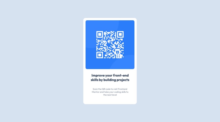
Resolução do desafio do QR-CODE apenas usando CSS e HTML
@vinnizo
Design comparison
SolutionDesign
Solution retrospective
Hey, guys! As i said on the README, i need some hints on how to position the attribution class right below the container class. In advance, thanks for the feedback :)
Community feedback
- @j-sherrickPosted over 1 year ago
Looks good, and congrats on completing your first challenge! One way to do this is to set the
bodyelement toflexandflex-directiontocolumn,align-itemsandjustify-contenttocenter, and set agapof ~3rem or so to get a good amount of whitespace in there. Feel free to poke around mine, I just completed it myself.Marked as helpful0
Please log in to post a comment
Log in with GitHubJoin our Discord community
Join thousands of Frontend Mentor community members taking the challenges, sharing resources, helping each other, and chatting about all things front-end!
Join our Discord
