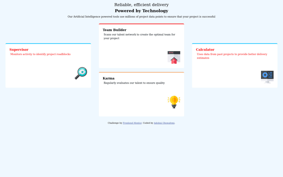
repsonsive four card section using grid and media
Design comparison
Solution retrospective
I would appreciate feedback on how to make responsive pages not break at all
Please log in to post a comment
Log in with GitHubCommunity feedback
- P@jmnyarega
Hi @Albusflames, good job on completing the challenge. I have a few suggestions for you:
- Everything with a
maintag. - Looks like the font family & font colours are a little bit off, you can refer to
style-guide.mdfor the right fonts. - Look into relative units, this will allow users to resize font sizes from their browser settings.
Otherwise, this is a good start.
- Everything with a
- @ChamuMutezva
- just be cautious with colors, some contrast make it difficult for the eyes. For me a dominant red is problematic. a small error message is reasonable in most use cases
- your site is missing headings, an
h1is one heading that you should always have. - headings should ascend in order without skipping headings
- for decorative images should have an empty value, alt values must be descriptive to help assistive technology users to visualize the message that is being put across.
Join our Discord community
Join thousands of Frontend Mentor community members taking the challenges, sharing resources, helping each other, and chatting about all things front-end!
Join our Discord
