Submitted almost 3 years ago
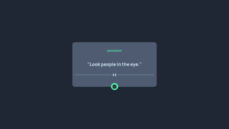
Reponsive using @media and consuming a API
#fetch
@gilcllys
Design comparison
SolutionDesign
Solution retrospective
My first project using a API , i'm so proud of my job and a i hope improve more
Community feedback
- @shashreesamuelPosted almost 3 years ago
Good job completing this challenge.
Keep up the good work
Your solution looks great however the color of the card that is displaying the advice is supposed to match the color shown in the design. Secondly there is a bit too much margin from the top of the advice
In terms of your accessibility issues simply wrap all your content between main tags
I hope this helps
Cheers Happy coding 👍
Marked as helpful0
Please log in to post a comment
Log in with GitHubJoin our Discord community
Join thousands of Frontend Mentor community members taking the challenges, sharing resources, helping each other, and chatting about all things front-end!
Join our Discord
