Design comparison
SolutionDesign
Solution retrospective
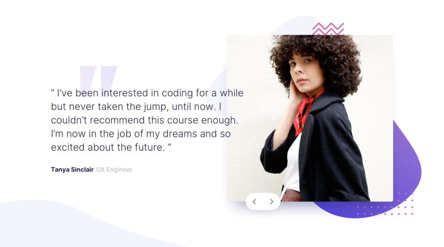
Hi! This is my solution for the Testimonials Slider. I struggled with positioning both the image and the navigation buttons correctly. I'm unsure how I could have done it differently and would love to get some tips on this so I can improve on it. Thanks in advance. ^^
Community feedback
Please log in to post a comment
Log in with GitHubJoin our Discord community
Join thousands of Frontend Mentor community members taking the challenges, sharing resources, helping each other, and chatting about all things front-end!
Join our Discord
