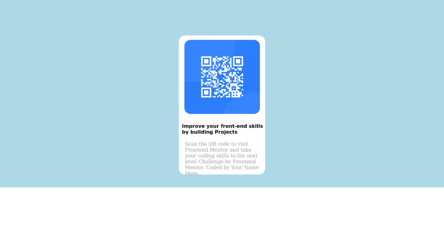
Design comparison
SolutionDesign
Community feedback
- @frank-itachiPosted almost 2 years ago
Hello there 👋. You did a good job!
I have some suggestions about your code that might interest you.
HTML 📄:
- Wrap the page's whole main content in the
<main>tag. - The heading order is important in the html structure so try to always start your headings and/or titles with an
<h1>tag and then you can increase by one if you need to use more heading in your html code. - The image is not decorative in this case so make sure that the
<img>element in your HTML code has an alternate (descriptive) short text. The reason for this is that screen readers can’t translate images into text. So to fix this you can do the following<img src=”…” alt=”short text” >
I hope you find it useful! 😄 Above all, the solution you submitted is great!
Happy
<coding />😎!0 - Wrap the page's whole main content in the
Please log in to post a comment
Log in with GitHubJoin our Discord community
Join thousands of Frontend Mentor community members taking the challenges, sharing resources, helping each other, and chatting about all things front-end!
Join our Discord
