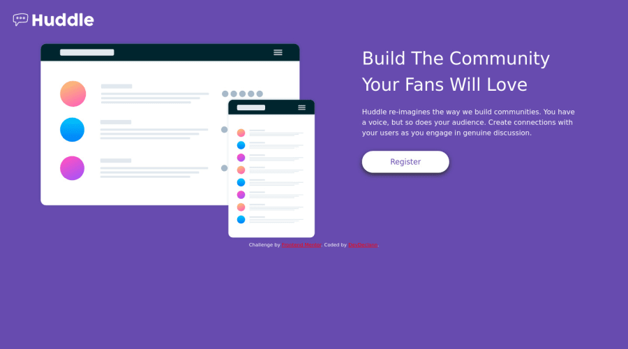
Not Found
Not Found
Not Found
Not Found
Not Found
Not Found
Not Found
Not Found
Not Found
Not Found
Not Found
Not Found
Not Found
Not Found
Not Found
Not Found
Not Found
Not Found
Not Found
Not Found

Submitted

Reponsive page using HTML, SCSS, MEDIA QUERIES

Declan 220

@engelbrechtz


Design comparison


SolutionDesign

Solution retrospective


Reponsive page using HTML, SCSS, MEDIA QUERIES.

This challenge was an interesting one, it was not what my first intention was. I've developed so that it's the mobile version as well as the desktop screen size. I did not included the social media Icons & I should of not added the drop-shadow to the button itself, due to the fact that its all about simplicity.

May I have feedback upon the responsive version of the page itself, thanks. Edit: It seems like the background Image was not added in the file... will fix

Kind regards, DevDeclann.

Community feedback

Vanza Setia 27,795

@vanzasetia

Posted

👋Hi DevDeclann!

I have a feedback for you, I think the @media (max-width: 375px), it's not the only media query that you need, my recommendation is that try to make it 100% responsive on any breakpoints. Also try to use flexbox or grid for this challenge, it would be much easier to do this challenge.

That's it! Hopefully this is helpful for you!

Marked as helpful

1

Declan 220

@engelbrechtz

Posted

@vanzasetia

Hey, Thanks for your feedback, I shall do this next-time! :)

0
T
ApplePieGiraffe 30,545

@ApplePieGiraffe

Posted

Hey there, Declan! 👋

Nice effort on this challenge! 👏

+1 to what Vanza Setia suggested. 😀 Consider using a tool like flexbox to layout sites (rather than things like floats, which you are using, in this case). They are much easier to work with once you get to know a little about them and they will make making your site responsive a breeze. If you'd like to learn more about flexbox, check out this fun little game that will help you learn and practice the fundamentals, or this thorough article from CSS Tricks that you can reference.

And switching to a mobile-friendly layout sooner would be a good idea to make your site look good on all screens. 😉

Keep coding (and happy coding, too)! 😁

Marked as helpful

0

Please log in to post a comment

Log in with GitHub
Discord logo

Join our Discord community

Join thousands of Frontend Mentor community members taking the challenges, sharing resources, helping each other, and chatting about all things front-end!

Join our Discord