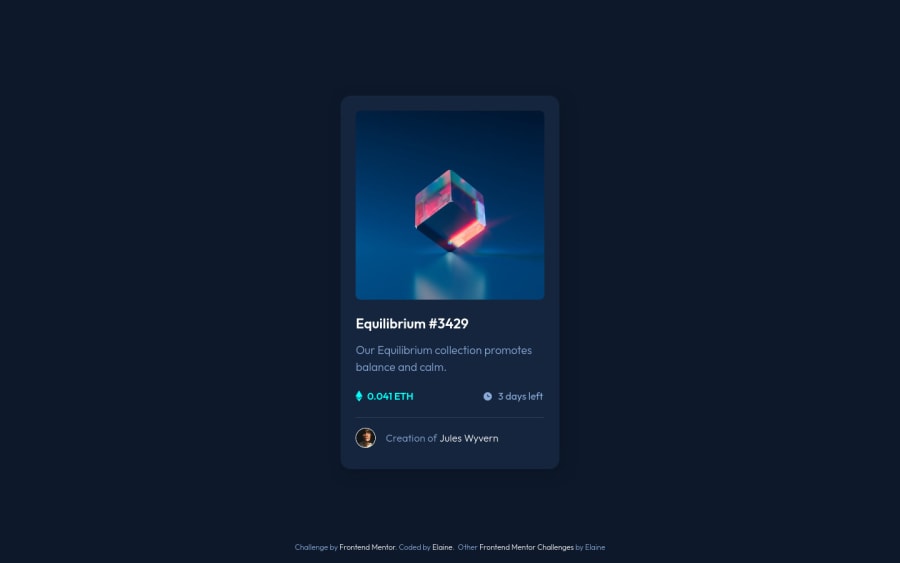
Design comparison
Community feedback
- @nirvayathapaPosted over 2 years ago
Reallly goood! I just want to know how did u get the perfect dimensions of the card and stuff?figma design file? Thanks u for answering!
3@elaineleungPosted over 2 years ago@nirvayathapa Thanks for checking out my work and also for the compliment :) I don't use the Figma design files since I'm not a Pro member (yet lol), but I think it's actually better not knowing because it forces me to pay attention to all the details, and that to me is part of the challenge. What I normally do is, I just line up my browser with the design image from the top and then just try to see which sizes work; I'd compare the designs by resizing the browser both vertically and horizontally as I'm working on it. What helps me is to use
remfor almost everything, including font-sizes. Good luck!4@nirvayathapaPosted over 2 years ago@elaineleung Damn .You r really hardworking and cool !Keep it up and thank u for answering!
1@CyrusKabirPosted over 2 years ago@nirvayathapa also you can use some image comparison slider (like here in front end mentor) on internet like this one: image compare slider
or you can made an image compare slider for yourself as challenge.(recommended) and another way is using Perfect Pixel browser extension.
0 - @CyrusKabirPosted over 2 years ago
Hi Elain. you did a clean and good job on this challenge. everything it's good and fine. I have a suggestion about your color variables naming. it's better to avoid specific color names (e.g --clr-cyan) as you used material design naming for other colors but this one it's not related to other ones. I recommend to read these two good articles about color naming:
hope I could help you. good luck.☻
2@elaineleungPosted over 2 years ago@CyrusKabir Thank you for your comment and suggestions! I only used
--clr-cyanbecause it is the only cyan style in this challenge; if there had been another cyan, then I would add in a number for sure. With these FEM challenges I don't normally use the primary/secondary/accent naming system, as sometimes there are lot of different colors given and I find it a lot less confusing just to stick to the names listed in the challenge since my focus is on coding and not design conventions. I'm mainly using this as practice, so I'm inclined to use what makes most sense to me; it would definitely be different if I was working on a team.1@viraj308Posted over 2 years ago@elaineleung Hi Elaine, Your website is so perfect, it's like god's work. I am a novice to web dev. does taking everything inside the main component resolves the accessibilitiy issues.why did you apply grid to main component? does it have anything to do with the growing and shrinking of the card with screen size.
0@elaineleungPosted over 2 years ago@viraj308 Hi Viraj, thank you for your compliment 🙂
About your questions:
-
Putting all the main content inside the
maintag can help with resolving some accessibility issues related to HTML semantic tags becausemainhelps the screen reader identify where the main important contents are. -
I used
display: gridon the main element mainly for centering the component; because I have a footer, I didn't want to usedisplay:gridon the body to center everything, otherwise the footer would be centered too with the card, and I only want the footer at the bottom. It doesn't really have anything to do with the card growing and shrinking; the responsive card size has to do with the responsive width properties I'm using.
0 -
Please log in to post a comment
Log in with GitHubJoin our Discord community
Join thousands of Frontend Mentor community members taking the challenges, sharing resources, helping each other, and chatting about all things front-end!
Join our Discord
