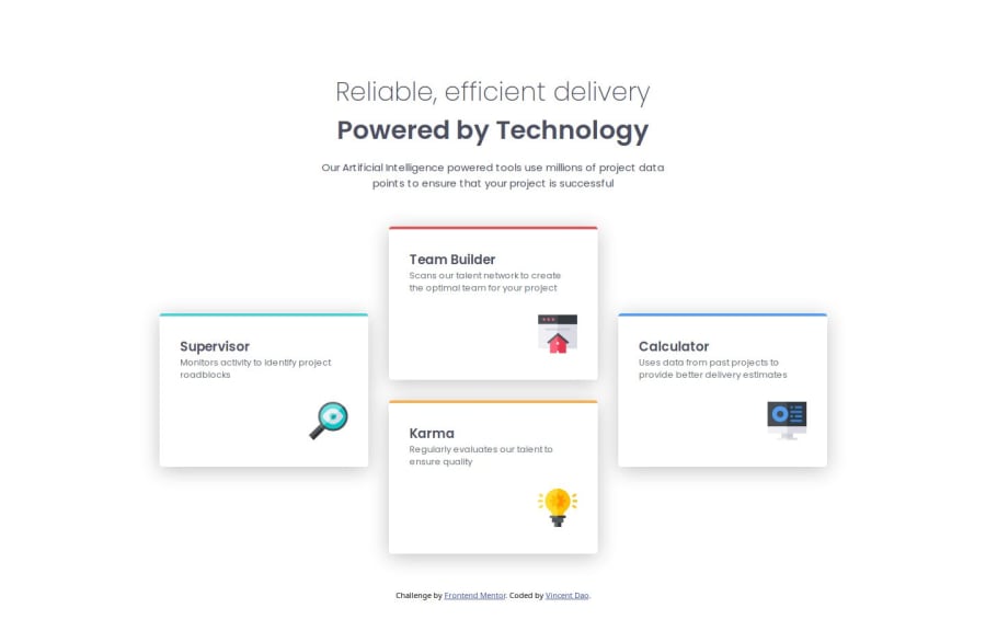


Design comparison

Solution retrospective
I am most proud of being able to fully utilise CSS Grid for the first time to complete a project. On top of that, being able to properly implement a responsive design that almost perfectly matches the mobile and desktop designs.
What I'd do differently next time would be to cut down on some more CSS maybe? Making it more concise and all. Along with that, I'd also place all my media queries together if their conditions are the same. (I only separated them this time to make it easier for me to code instead of constantly scrolling back and forth)
What challenges did you encounter, and how did you overcome them?I was slightly stuck on the usage of grid-rows and grid-columns but with a bit of tinkering the issue I had was resolved.
What specific areas of your project would you like help with?Since I'm new to using CSS Grid, good practices would be nice or any other HTML or CSS tips would be greatly appreciated too!

Join our Discord community
Join thousands of Frontend Mentor community members taking the challenges, sharing resources, helping each other, and chatting about all things front-end!
Join our Discord