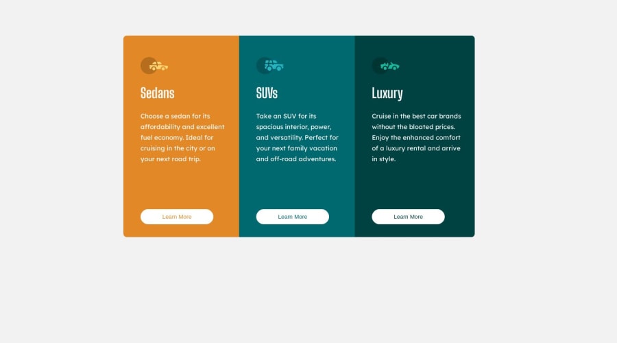
reponsive 3-colum-preview-card using html css
Design comparison
Solution retrospective
At first i this design i have learn about text alignments and images settings
Community feedback
- @tesla-ambassadorPosted 12 months ago
Hey sheikhhaseeb559 this looks impressive and I'm glad you learned about text and alignments and how to work with images after completing this challenge that's a great start! Your challenge however lacks 2 things that is:
- Responsiveness: This helps your solution or website to be viewed on different screen sizes. If you want to learn more about this you can visit w3 schools responsive design. It's a critical design principle.
- Layout alignment: You could consider learning about flexbox. It will help you to position your main card in the centre and it's useful for most of the times you are going to manipulate the layout. I also took time to look at your css code and realized you were using id's as selectors. It's not wrong if you are going to style one specific instance of an element. It's better you stick to classes cause the code between classes can also be shared with other elements.
This is a good solution. Keep up the good work!
Marked as helpful1@sheikhhaseeb559Posted 12 months ago@tesla-ambassador Thanks Now i will learn about these things and also apply to my next project if you have more advice for me I'll be happy to hear and implement
1@tesla-ambassadorPosted 12 months ago@sheikhhaseeb559 I'll be more than willing to help!
0@sheikhhaseeb559Posted 12 months ago@tesla-ambassador is django is worth learning today or angular
0
Please log in to post a comment
Log in with GitHubJoin our Discord community
Join thousands of Frontend Mentor community members taking the challenges, sharing resources, helping each other, and chatting about all things front-end!
Join our Discord