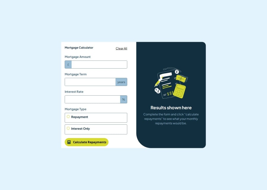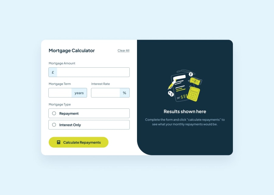
Repayment page using HTML CSS JS validation API and scss
Design comparison
Solution retrospective
Using the js validation API and sass was a breath of fresh air
Community feedback
- @grace-snowPosted 6 months ago
The mortgage type must be structured as a fieldset with legend. Look up how to structure this kind of group of form fields correctly as it is essential to know.
The other issue I notice with accessibility is the errors are not programmatically linked to their inputs. Add unique IDs to each element and use aria-desciribedby on the inputs to reference them.
Marked as helpful0 - @CitycodPosted 6 months ago
You did well Just adjust the spacing at the mortgage calculator left side, work on the spacing at the bottom and up inside the container u created
0
Please log in to post a comment
Log in with GitHubJoin our Discord community
Join thousands of Frontend Mentor community members taking the challenges, sharing resources, helping each other, and chatting about all things front-end!
Join our Discord
