

Design comparison
SolutionDesign

Solution retrospective
What are you most proud of, and what would you do differently next time?
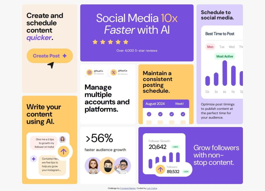
There was no tablet viewport design so I took some liberties with that one, I also used grid areas for a more explicit approach, if you can see where I can improve would gladly hear you
What challenges did you encounter, and how did you overcome them?In the beginning I experienced some difficulty trying to make the layout have the correct order but later I came to realize I needed 4 rows instead of 3 and everything come into place after it
What specific areas of your project would you like help with?I have a lot of difficulties giving the correct aspect ratio to the images i would love to have a good resource to check that one out
Community feedback
Please log in to post a comment
Log in with GitHubJoin our Discord community
Join thousands of Frontend Mentor community members taking the challenges, sharing resources, helping each other, and chatting about all things front-end!
Join our Discord