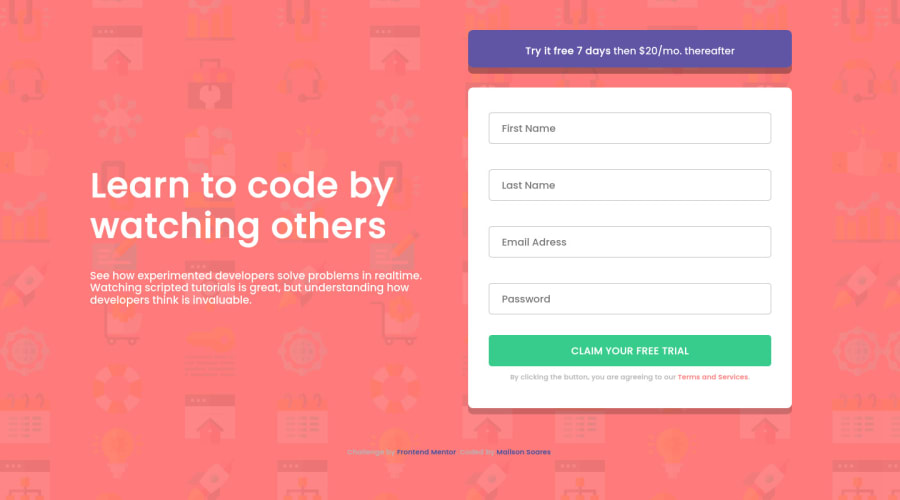

Design comparison

Solution retrospective
Was the solution that I proposed acceptable? Where can I improve?
Community feedback
- @steventobenPosted about 4 years ago
This looks nice I'd just address a few things. First thing is I would set font-size in rem units instead of pixels, this helps both accessibility and responsiveness. Second thing is on your paragraph text, instead of using <br> tags for every line-break you could set the max-width of the paragraph to something like 50ch. This is a really common strategy to make paragraphs more readable and easier on the eyes. Another thing is giving paragraphs line-height of around 1.5 (unitless). One more thing I'd do it clear the form when the submit button is pressed. Currently when you press the button the fields don't have their values cleared.
Other than that I'd say it looks good, for places to improve I suggest using rem for font-sizes and other measurements. Another thing is try to size things implicitly by setting a max/min height/width and letting the inner content size the box, instead of explicitly setting widths and heights. Good job overall it looks really nice!
1 - @mailsonsoaresPosted about 4 years ago
Thanks for the feedback. It is good to know that there is someone on the other side. I'll make some adjustments and follow your tips for the next projects. Thank you very much!
0

Please log in to post a comment
Log in with GitHubJoin our Discord community
Join thousands of Frontend Mentor community members taking the challenges, sharing resources, helping each other, and chatting about all things front-end!
Join our Discord