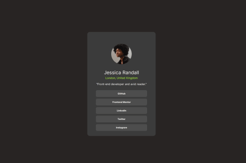
Design comparison
Solution retrospective
Superei as dificuldades para subir meus projetos no GitHub.
Community feedback
- @UnifiesPosted 2 days ago
Hi there, Guilherme. Great work completing this challenge!
A couple updates for better code quality:-
Include semantic HTML and a level one heading
<h1>
in your code - It is best practice to contain all content within distinct regions such as the<header>
,<nav>
,<main>
, and<footer>
. Here's a guide to the full doc that explains this.Consider changing up your code and adding this..
.perfil{ display: flex; flex-direction: column align-items: center; }
..to properly center the container div. It start to look off and right-aligned from around 850px and the content just gets cropped out from 630px. From there on, it's not responsive.
Consider above and add some code to make the solution responsive and fully visible on smaller screens. Example, using media query, add some code to change the width of the perfil container from a static 400px to 80-90% of the screen width and check on the content sizes to ensure they all fit as should within the updated width.
In order to create a clean, reusable code though, it is recommended to create colors, fonts, and sizes as variables like so:
:root { /* Colors */ --White: hsl(0, 0%, 100%); --Slate-300: hsl(212, 45%, 89%); --Slate-500: hsl(216, 15%, 48%); --Slate-900: hsl(218, 44%, 22%); /* Fonts */ --fs-h2: 0.95rem; --fs-p: 0.85rem; --fw-400: 400; --fw-700: 700; }
and then you can use them for styling like
background-color: var(--Slate-300);
.Reason being: These things may change in a real project, so when it does all you have to do is change them from the root instead of searching in the whole css file/s.
--Slate-300
is a custom name, you can name it anything you want. But for readability giving it a meaningful name would be better.Ensure to check the style-guide.md file on all challenges, it includes the fonts, color, and weights to use in order to match the design. The colors on your solution look a tad bit different, although this doesn't affect your solution in any way as we were asked to edit copy and colors to our preferences - I just thought it a worthy mention if the difference in colors was not intentional.
Marked as helpful0
Please log in to post a comment
Log in with GitHubJoin our Discord community
Join thousands of Frontend Mentor community members taking the challenges, sharing resources, helping each other, and chatting about all things front-end!
Join our Discord