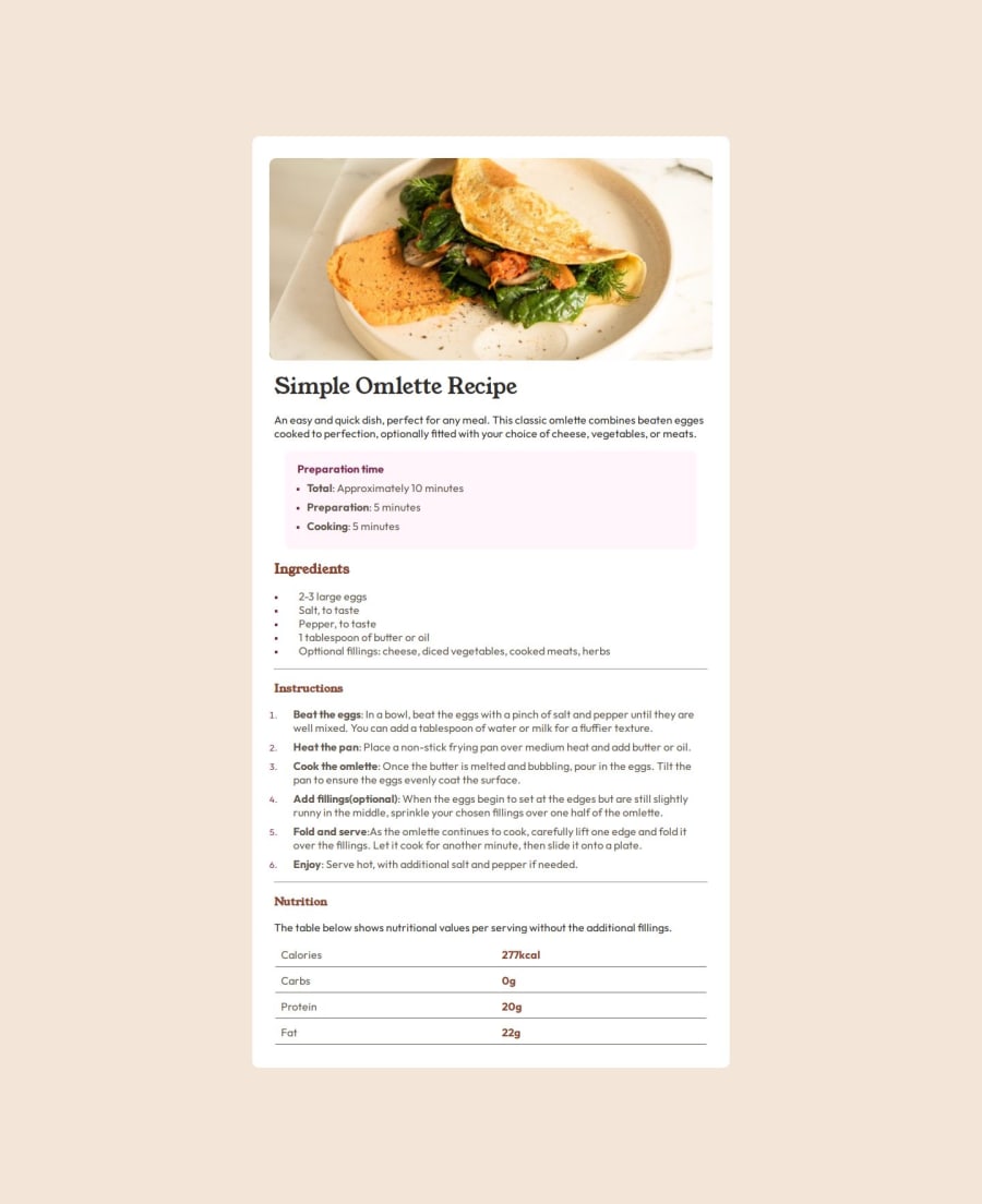
Design comparison
Solution retrospective
Proud that I am solidifying my initial knowledge of html and css, this project helped me research more and learn new things and ways to overcome various issues i encountered, basically I was able to increase my knowledge base
What challenges did you encounter, and how did you overcome them?I had no clue about how to go about making tables, either the tag, elements nor the correct semantics also with the square shaped list markers and how to style them and as well as making the page responsive. It was a fun experience pooling knowledge from various sources mostly youtube and gpt to help me with parts of this project and sincerely it just took me an unreasonable amount of time trying to debug and solve the issues myself.
What specific areas of your project would you like help with?Website responsiveness, this position element with its elements and how to properly use them, the research i went about and used basically used this for the responsive version, that is so the image does no longer respect the parent container padding and spreads to the full extent of the container, while i used this i am dissatisfied that i have not made the knowledge my own
Community feedback
Please log in to post a comment
Log in with GitHubJoin our Discord community
Join thousands of Frontend Mentor community members taking the challenges, sharing resources, helping each other, and chatting about all things front-end!
Join our Discord
