Design comparison
Solution retrospective
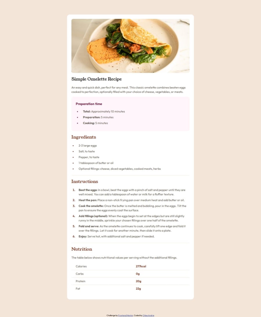
I'm proud of completing another Frontend Mentor challenge! I have not used html tables frequently; I tend to gravitate to css flexbox or grid. In this case, an html table seemed appropriate for the nutrition section.
What challenges did you encounter, and how did you overcome them?I'm hoping to continue to learn about using html tables and how best to use them while prioritizing accessibility.
What specific areas of your project would you like help with?Is there a better way to improve responsiveness? What would you change or do differently? Thanks for the feedback!
Community feedback
- P@wcyin9Posted 12 months ago
Hi there! I really liked your solution, and your choice of using html table for the nutrition section is the perfect choice! I myself did not come to that conclusion when I did this challenge, so thank you so much for enlightening me. I will go back and implement this in my design so I can practice html tables more.
In terms of responsive design, the only area I spotted was that the mobile version differed from the design given in Figma. There were no margins outside of the container in the mobile version, and the peach background is nowhere in view. The recipe itself fills out the entire viewport width.
Over than that, you did a very good job. Keep up the great work!
Marked as helpful0
Please log in to post a comment
Log in with GitHubJoin our Discord community
Join thousands of Frontend Mentor community members taking the challenges, sharing resources, helping each other, and chatting about all things front-end!
Join our Discord
