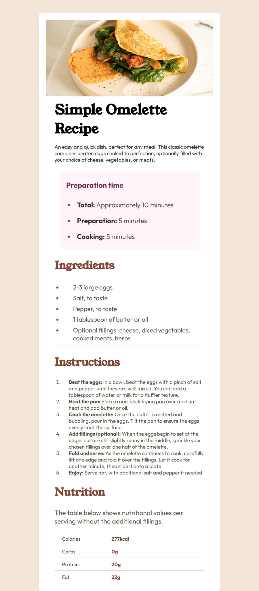
Recipes Pages using CSS with Media Queries and flex Box
Design comparison
Solution retrospective
I really enjoyed the process to make this component. I feel it so easy, and maybe is because of the practice i developed in this page. The things work properly without much struggle
What challenges did you encounter, and how did you overcome them?Its only problems with the image. Sometimes i dont know how to mesure the height or width, but is pretty solved i guess
What specific areas of your project would you like help with?If its something major to fix, i would like feedback.
I think i forgot to put border-radius to the image in desktop view and some weights
Community feedback
- @DanielfwwPosted 7 months ago
Hey Ramiro - good job finishing this project, took me some time to finish this myself.
Just few things to point out - you can actually measure the container for this project by using Figma or download irfanview - you would be able to measure pixels on the image that way.
Also for the mobile version - the image is way too big so you probably want to resize this in css for a mobile version - best way for this would be giving class to the image.
<section>
  <img src="./assets/images/image-omelette.jpeg" alt="">
</section>
Hope this helps a little and good luck on your future projects.
Marked as helpful0
Please log in to post a comment
Log in with GitHubJoin our Discord community
Join thousands of Frontend Mentor community members taking the challenges, sharing resources, helping each other, and chatting about all things front-end!
Join our Discord
