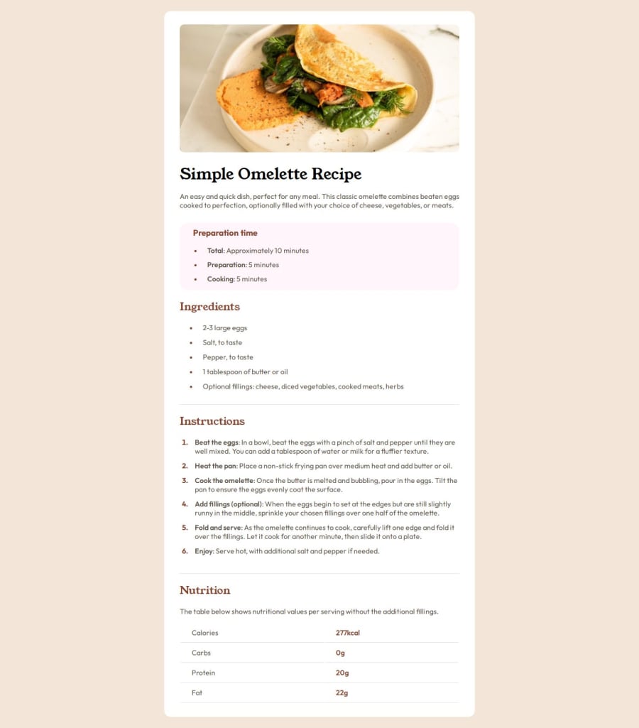
Design comparison
Solution retrospective
I'm proud I was able to minify some of my CSS and learned a new tool "google lighthouse" to analyze the SEO of my webpage and the result I got was: performance: 69, Accessibility: 96, Best Practice: 100, SEO: 91.
from the results I got from "google lighthouse", I made changes based on the suggestions such as: add "alt" to the image, add meta description, so on.
What challenges did you encounter, and how did you overcome them?First: The nutrition section of the webpage uses a table tag and I struggled with getting a single "border-bottom" line. Instead, there's two lines for each "table data." Second: Since I minified my CSS code, navigating the "style.css" can be confusing. Now I'm trying to make the codebase cleaner and readable.
What specific areas of your project would you like help with?All feedback is welcome not matter how small the assistance may be.
Community feedback
- @alberto-rjPosted about 1 year ago
Hi, @Si1entERA! Congratulations on investing your time and leveling up with the challenge, Recipe page.
I have some code suggestions that can help you improve your solution to this challenge.
HTML
Line 10: If you want to specify the description of the page, instead of
name="description of the page", just usename="description".Bad:
<meta
  name="description of the page"
  content="put your page description here"
/>
Good:
<meta
  name="description"
  content="put your page description here"
/>
The preparation time section
Line 43: Instead of using the
h3tag, you could use theh2tag because in this case it is in the correct hierarchical order.Titles are in the correct hierarchical order when:
- h1 is the main title;
- h2 is just the subtitle of h1;
- h3 is just the subtitle of h2;
- h4 is just the subtitle of h3;
- h5 is just the subtitle of h4;
- h6 is just the subtitle of h5;
- h5 is just the subtitle of h4;
- h4 is just the subtitle of h3;
- h3 is just the subtitle of h2;
- h2 is just the subtitle of h1;
The nutrition section
Instead of using the
tdtag, you could use thethtag for each column in the table, because in this case it expresses this semantic meaning.PERFORMANCE
- Convert the
./assets/images/image-omelette.jpegimage to next-gen formats, such as WebP and AVIF because those formats often provide better compression than PNG or JPEG.
This website can help you solve this problem
CSS
Use the CSS
remunit: It is good practice to use theremunit to specify thefont-size,margin,padding,width,height..., instead of the CSSpxunit. Learn more hereKeep learning, coding and sharing! 🌟
Happy coding! 🚀
Marked as helpful0 - h1 is the main title;
- @VakhoCloudPosted about 1 year ago
Nice work. give background color to body, in this way background color will wrap everything.
1
Please log in to post a comment
Log in with GitHubJoin our Discord community
Join thousands of Frontend Mentor community members taking the challenges, sharing resources, helping each other, and chatting about all things front-end!
Join our Discord
