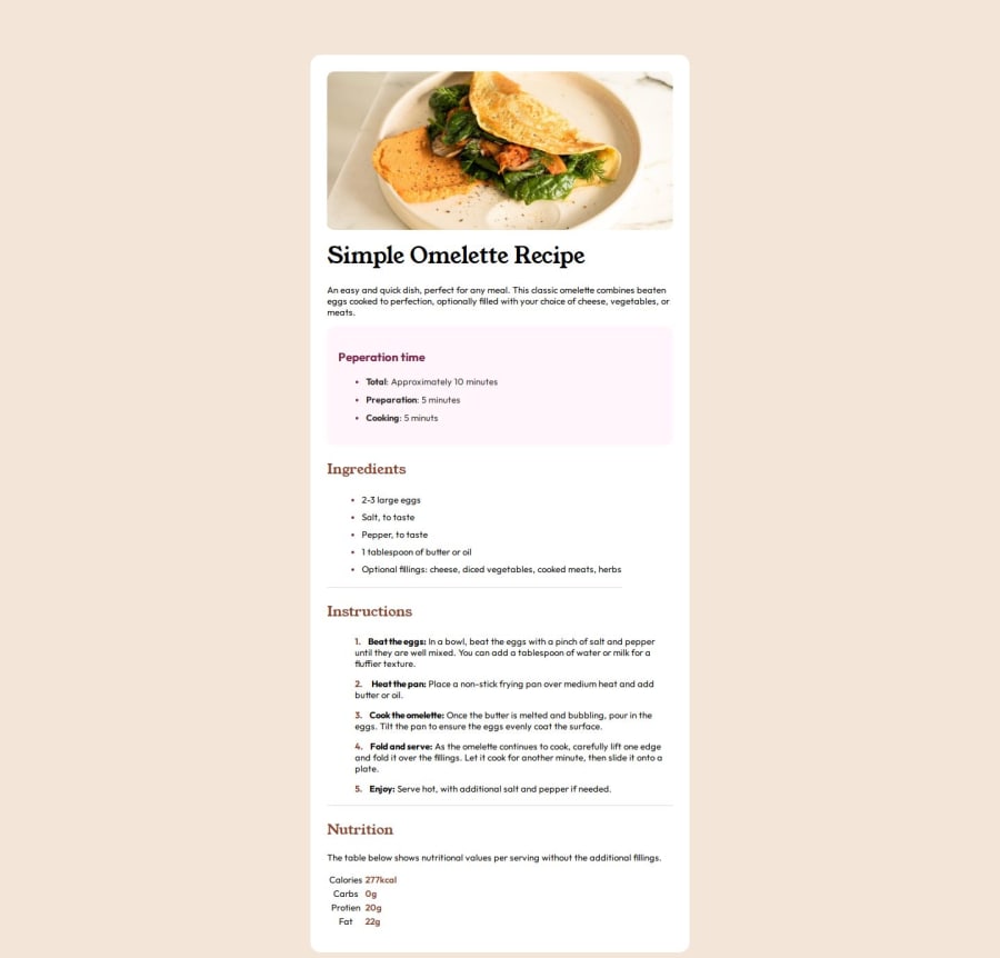
Design comparison
Solution retrospective
Feedback appreciated
Community feedback
- @Wanjiru-MPosted 9 months ago
Great job on tackling the challenge! Your solution is well thought out and effectively addresses the requirements.
However, I noticed a small styling issue in the nutrition section. The layout could be improved by adding a horizontal line below each row. You can easily achieve this by using the nth-child selector in your CSS, similar to the following sample code:
.table-split tr:not(:last-child) td { border-bottom: 1px groove hsl(300, 18%, 87%); }Marked as helpful1 - @Ezekiel225Posted 9 months ago
Hello there 👋 @HaarithBinSabur.
Good job on completing the challenge !
Your project looks really good!
I have a suggestion about your code that might interest you.
There is an very useful browser extension called Perfect Pixel that allow you compare with the design image and thus see the exact dimensions. I recommend it to you.
I hope this suggestion is useful for future projects.
Keep up the excellent work and continue to challenge yourself with new projects. Your progress is impressive, and each project is a step forward in your front-end development journey! 🚀🌟.
Other than that, great job!
Happy coding.
Marked as helpful1
Please log in to post a comment
Log in with GitHubJoin our Discord community
Join thousands of Frontend Mentor community members taking the challenges, sharing resources, helping each other, and chatting about all things front-end!
Join our Discord
