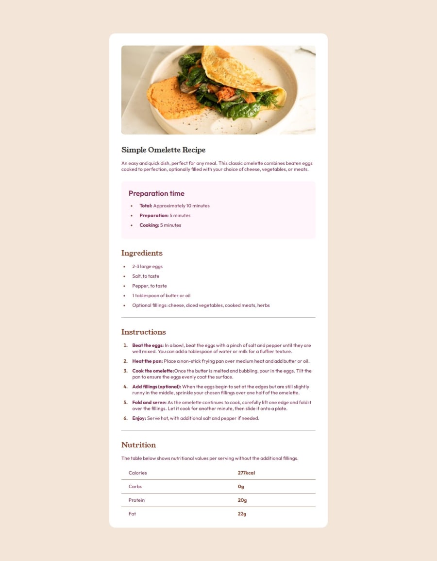
Design comparison
Solution retrospective
I'm proud of the overall result. But what I would do differently next time is to focus more time on analysing the design before making the html mark-up, because it took me a lot of time to correct it when you already settled all the styles.
What challenges did you encounter, and how did you overcome them?Of course when there is no Figma file, it's a bit difficult to guess to sizes. For me the challenge was that I need to figure out a way to change how the image looks like switching from desktop to mobile, but I've done it by splitting the recipe element (which contains that white card) into two divs, one for the image and the other for the text, and with media query I've managed to make it look similar the the design.
What specific areas of your project would you like help with?I would like to know if I used the correct html element for this challenge. I welcome any of your feedbacks.😊
Community feedback
Please log in to post a comment
Log in with GitHubJoin our Discord community
Join thousands of Frontend Mentor community members taking the challenges, sharing resources, helping each other, and chatting about all things front-end!
Join our Discord
