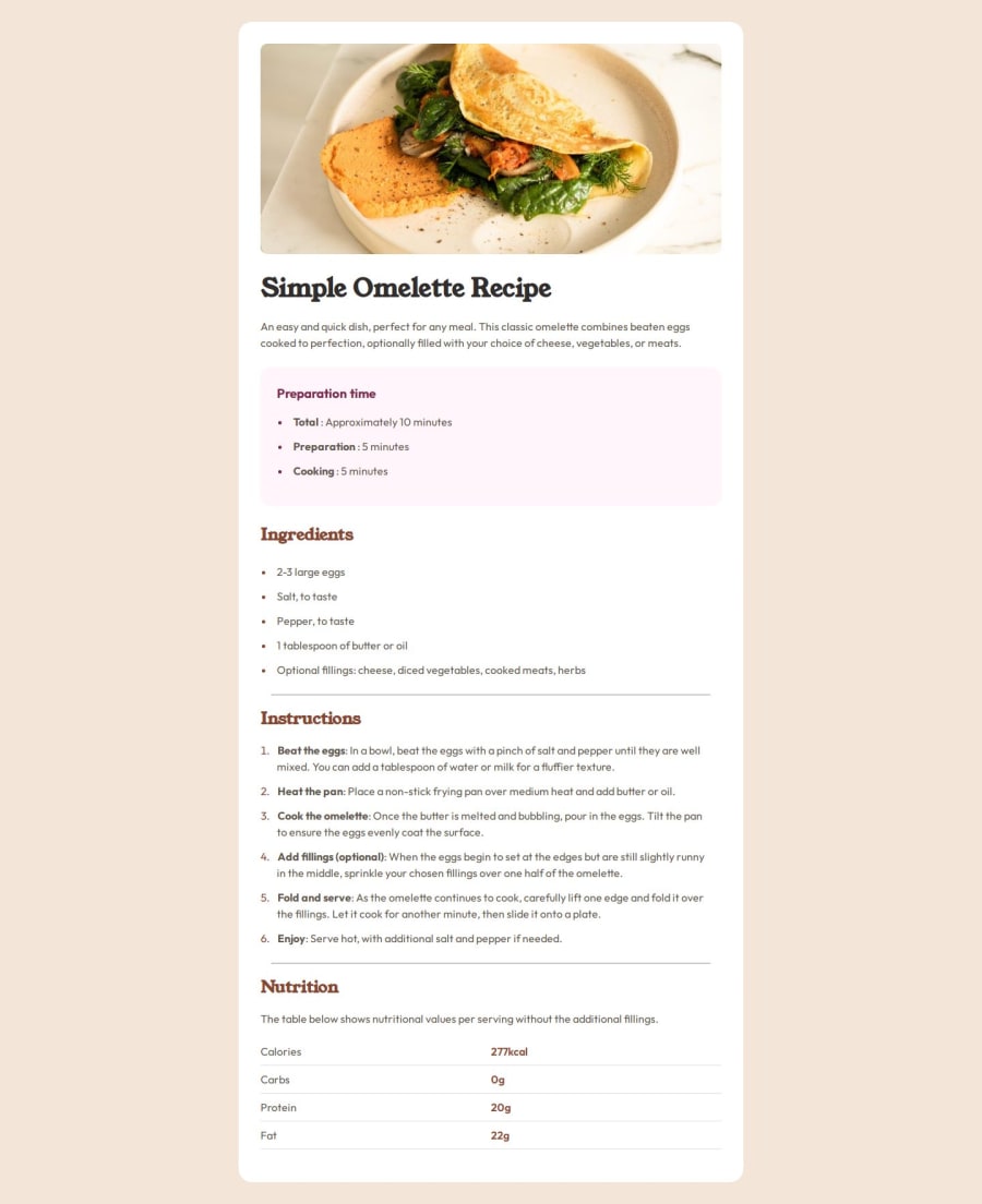
Design comparison
Solution retrospective
proud of sticking with this and not getting frustrated with the details of the project
What challenges did you encounter, and how did you overcome them?lots of little details i didn't anticipate. getting all of the list bullets and text aligned, along with the leading bolded text on those items was kind of tedious.
What specific areas of your project would you like help with?i'm terrible at naming classes in css and tend to get lost in the weeds.
Community feedback
- @Endy1381Posted 12 months ago
You nailed it! this looks almost as same as the original design. just maybe add a margin-top to lower the card thing and you will be good.
1@joeyturboPosted 12 months ago@Endy1381 hey thanks so much. i took waaaayy to long on this :) which i guess is just right for my skill level. i realized after uploading that i needed a little more top margin. also i need to go back and fix some of the heading text it looks a little too weighty. thanks again for taking the time to comment.
1
Please log in to post a comment
Log in with GitHubJoin our Discord community
Join thousands of Frontend Mentor community members taking the challenges, sharing resources, helping each other, and chatting about all things front-end!
Join our Discord
