Design comparison
Solution retrospective
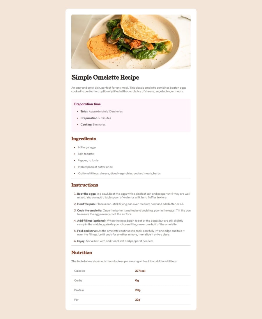
Im proud to see my page is responsive in both desktop and mobile screen
What challenges did you encounter, and how did you overcome them?I was confused with the design since it has 2 pages back to back i thought i had to code it exactly as it is in the design
What specific areas of your project would you like help with?Need help with best practices and css reset
Please log in to post a comment
Log in with GitHubCommunity feedback
- @grace-snow
I hope this feedback is helpful...
- Look up how and when to write alt text on images. There is a great post in the resources channel on discord about this. The alt text on the image you have written here is not right.
- Change the summary element to a paragraph.
- Headings must go in order. This is extremely important. Headings give the outline of the document content, much like the contents page of any big document, and are used extensively for navigation by assistive tech users. It's an accessibility requirement failure to skip heading levels like this from h1 to h3.
- Don't add non breaking space code in the html. Use css! In most sites you would not have the luxury of changing the content code like this.
- Remember strong tags add bold emphasis not spans.
- The table must include header cells. This is essential. Ideally, these should have the scope attribute set to row.
- There is no need for an extra span inside the table cells. Keep html as simple as possible.
- Get into the habit of including a full modern css reset at the start of the styles in every project. Andy Bell or Josh Comeau both have good ones you can look up and use.
- Did you mean to set the body's min height to 100vh perhaps? (Not 10vh)
- Remove any css properties you are repeating/overruling like padding on the body.
- The recipe image does not need height 100%.
- This challenge does not need a media query I think. If it did though it would need to be (a) defined in rem or em not px and (b) be a min-width media query targeting the larger screen sizes because almost all projects should be built with the mobile styles as the default. Read about how to make sites responsive and use media queries well
- All I can think that may change in a media query may be padding and font size, but if so font sizes would need to be explicitly stated not just a keyword value that removes all control of what that means on different browsers.
Marked as helpful - @Albrt78
Nice 👍
Join our Discord community
Join thousands of Frontend Mentor community members taking the challenges, sharing resources, helping each other, and chatting about all things front-end!
Join our Discord
